Expert’s Rating
Pros
- Dynamic Island is a big step forward for the iPhone interface
- Always-on display, finally
- 48MP camera shines in ProRAW format
- Excellent battery life
Cons
- Photos are a bit over-processed
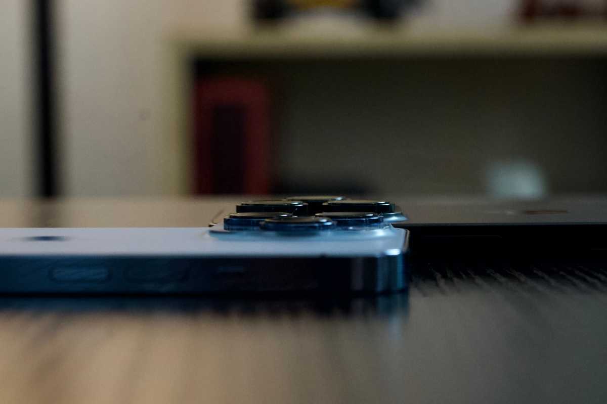
- Big cameras can get in the way
- Some features are waiting on software updates
Our Verdict
The always-on display and especially the Dynamic Island represent a big step forward for how you use your iPhone, and Apple still leads the pack in performance. The new cameras are great, but Apple’s photo processing is a little too aggressive.
Price When Reviewed
$999
Best Prices Today: iPhone 14 Pro

$999
The yearly iPhone release, and indeed most smartphone releases, have gotten kind of boring: The latest model is a little faster, the camera’s better, maybe there’s some stand-out gimmick that will feature in all the ads but won’t really improve the way you use your phone. In general, there’s not a lot to talk about.
This year, with the iPhone 14 Pro, I’m happy to report that there is something interesting to talk about. Naturally, the iPhone 14 is a little faster and yes, the camera is indeed better. But there are two other new features this year, exclusive to the Pro models, that actually change the way you use your iPhone for the better: the always-on display and Dynamic Island.
Apple is late to deliver an always-on display, but its implementation is excellent and, combined with software features of iOS 16, allows you to “use” your iPhone without even picking it up far more often than you might think. When you do pick it up, the Dynamic Island (Apple’s name for a new interface built around the camera cut-out at the top of the display) is an absolute revelation. It is Apple’s interface design at its best and sure to be copied by it’s rivals. It’s such a great idea, executed so well, that it may come to define the iPhone user experience for years to come.
That delightful Dynamic Island
We like to drag Apple when it makes bad interfaces mistakes, like the disastrous macOS Ventura settings or that whole iOS 7 thing. But when Apple brings its A-game, it can bring to market interface experiences that set the trend for years. The Dynamic Island is perhaps Apple’s best interface in years.
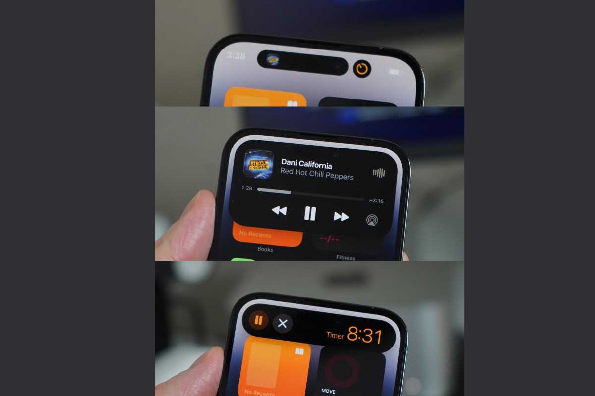
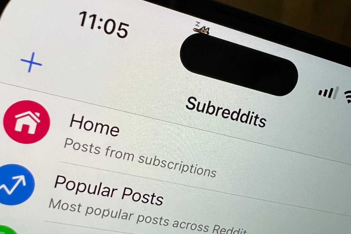
To make the Dynamic Island, Apple took the notch that holds all the Face ID sensors and front-facing camera, shrunk it, and moved it down into a little pill-shaped cutout (technically two cutouts, with the OLED display set black in-between to join them). That’s alone is not a new idea, but what Apple has done with it is. This cutout will grow and change in lively ways to show you alerts and data. Connect your AirPods and the little island extends for a few seconds to show the connection message. Use Face ID and, instead of a bubble in the middle of your screen, the island extends downward to show the Face ID alert. Follow a sporting event and the Island extends to either side to display each team’s logo and score. Start at timer and get a timer icon and the remaining time. Play music and get album art and a fun little waveform animation.
If you have more than one background activity going at once, the island splits. You can see album art for the music you have playing and a little timer icon, all while you browse Twitter or chat in Messages.
Foundry
The Dynamic Island does more than just display live information about background activities, though. It’s interactive in simple and intuitive ways, too. Tap on any activity up there and you’ll hop right over to the associated app. Tap and hold and the island expands to show more information and mini-controls. (If I had to pick a nit, the long-press and tap interactions should be reversed.) Animations for the way the island grows and shrinks, changes shape, and “absorbs” or “pops out” apps are fluid and playful.
Dynamic Island takes a sort of necessary evil of modern smartphone design–missing screen space for the front camera and sensors–and turns it into a highly desirable interface element. It’s a sort of “home base” for anything going on with your iPhone other than the current full-screen application. This is one of those rare design inventions that adds capability while reducing complexity. The way it works is simple, intuitive, and easily discoverable. It surfaces useful information, but also provides a way to do light multitasking without swapping back and forth between apps.
It’s not simply a place to display notifications in a new manner–that would make it attractive, but not more useful. Notifications are, for lack of a better descriptor, an app alert log of things that happened–you received a text, someone rang your doorbell, your tweet got 100 likes. View them now, view them later. The Dynamic Island is a way to see things for which an “app event log” doesn’t make sense, either because they’re currently ongoing or because they’re brief system alerts that don’t need to be viewed later (like Face ID authenticating or AirPods connecting).
It already works with plenty of apps, simply because it ties into frameworks like CallKit and the NowPlaying interface. Apps like Overcast, Skype, WhatsApp, and Spotify work from the start, without modification. This fall when an iOS 16 update adds Live Activities (live-updating, time-limited notifications to track current activities), those will work with the island as well.
The Dynamic Island is such a delightful feature, adding so much utility to iPhone while making it even easier to use, that it very well should be a defining characteristic of what it means to “be an iPhone.” It will be expanded upon in future iOS releases, and copied by Apple’s competitors. It’s a home run, and deserves all the attention it’s getting.
Five years ago, when Tim Cook introduced the iPhone X, he said it “set the path for technology for the next decade.” It was more expensive than any iPhone before at $999, but redefined the iPhone with an edge-to-edge display and Face ID. The very next year, when Apple introduced the iPhone XS ($999), it also gave us the iPhone XR ($749), bringing Face ID and an edge-to-edge display to a more affordable price. I hope that precedent is followed again, and we get the Dynamic Island on all 2023 iPhones. As with the core innovations of the iPhone X, this should set a technology path for years to come.
Always-on display, refined
Always-on displays have been a staple of Android phones for years. It would be weird to buy one that didn’t have it today, even on a more affordable model. So Apple is late to the party in building an iPhone with an always-on display, and in typical Apple fashion, what it delivered is just a little bit more refined than the industry standard.
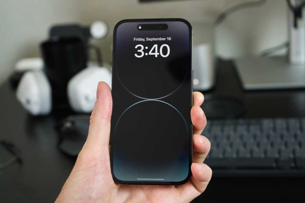
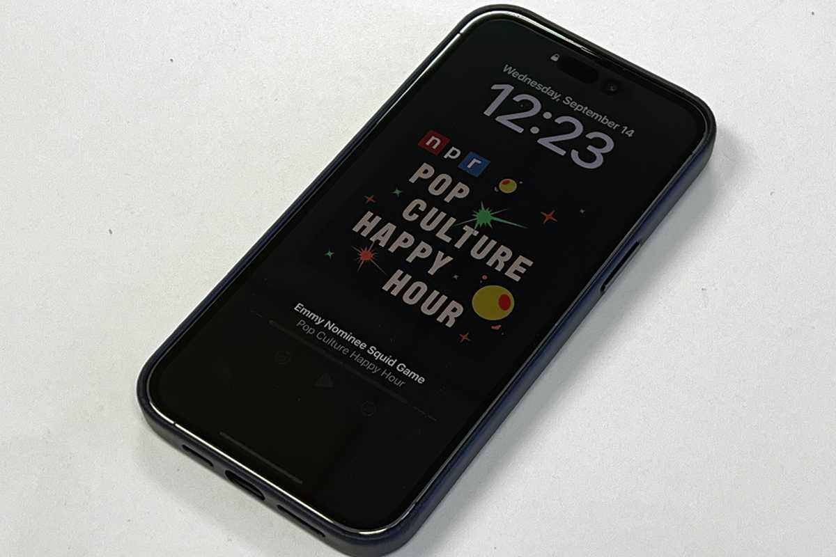
To start, when your lock screen goes into the always-on mode, it keeps your wallpaper (or album art) visible. It’s very dim, but it’s clearly there, and Apple even massages the colors so they still look okay. The time and date and your lock screen widgets are of course visible, as are your notifications. The phone does a good job of adjusting the brightness of this mode to suit ambient light, including going very dark when in a dark room so it’s not blaring visible on your bedside table.
IDG
Keeping your lock screen artwork visible isn’t the only refinement Apple has made. As with most Android phones, the screen turns completely off when face down on a table or when in a pocket or bag. But it also turns off if you’re wearing a connected Apple Watch and step far enough away, and then turns back on again as you step closer, and completely shuts off when you enter the Sleep focus mode. What’s more, this mode is not just for the lock screen, as Apple has created special “always-on” display modes for four apps: Apple Maps, Phone, Voice Memos, and Apple TV Remote. When using these apps, the phone doesn’t just dim the display while keeping the the apps active, but instead shows a custom simplified and easy-to-read interface. This is a really nice touch, and I hope Apple expands on the app list, eventually providing a framework for third-party developers to use.
The always-on feature does seem to have a minor impact on battery life, though it’s very difficult to quantify. A lot of it seems to depend on how bright your typical ambient light is. In my home, I find that there’s almost no difference at all in how long my battery lasts with it on or off, but if you spend a lot of time in a bright office or outdoors, your experience may vary. You can always turn it off if need be, but I think most users will find their battery still comfortably lasts all day even with it enabled.
While I’m talking about the display, I should mention its extremes. It it can drop all the way down to 1Hz (which it does only in always-on display mode) to save battery, and can also get really bright. I didn’t notice that the 1,600 nits of peak HDR brightness was much different than 1,200 nits of the iPhone 13 Pro when watching HDR video, but this new display can crank up all the way to 2,000 nits in bright sunlight, which is way brighter than before and makes your screen much easier to read in direct sunlight.
48 million little pixels
Of course the latest iPhone has an upgraded camera…that’s as sure as death and taxes. The star of the show this year is a new 48MP main wide-angle camera. It’s got a much bigger sensor with a different arrangement of sub-pixels and an f/1.78 aperture. That’s not as wide as the f/1.5 of the iPhone 13 Pro, but the much larger size means it still captures a lot more light and produces a more pronounced natural depth-of-field effect.
Foundry
By default, this camera adds together pixels in 2×2 groups, producing a 12MP shot much like earlier iPhones that has improved performance in low light. It’s got second-generation optical image stabilization and 100 percent of the pixels are focus pixels; in my experience, it quickly and accurately locks on to subjects. Unfortunately, the minimum focus distance is a bit longer, going from 150mm (5.9 inches) to 200mm (7.8 inches), so it loses focus as things get close to the lens and you have to switch to the Ultra-Wide camera.
The wide camera, combined with Apple’s new computational photography algorithms (which it calls “Photonic Engine,” as Apple has to give everything a brand name), is indeed an improvement over that on the iPhone 13 Pro, especially in low light. But the difference is subtle enough in most conditions that your average person isn’t going to notice a big difference. Where the camera really shines is when you take full 48MP shots.
You can only do this in ProRAW format, which makes every photo around 50-80 megabytes. You can capture impressive detail and dynamic range this way, but it really is going to be best appreciated by the sort of professionals and hobbyists who are used to processing RAW images to get the best final shot. If you’re the point-and-shoot type, it’s overkill.

Foundry

Foundry
This big sensor enables another fun trick everyone can appreciate, though. By cropping in to the center 12 megapixels of the sensor, you effectively get a 2x optical telephoto mode with a 48mm focal length. It’s great to have this back–when Apple switched from a 2x to a 3x telephoto in last year’s iPhone 13 Pro, it gave us a much better means of shooting actual telephoto shots to capture distant objects. But there’s a reason photographers call lens with a 50mm focal length “normal lenses”–they capture an image that roughly approximates the part of a person’s field of view they can focus on. It produces images that look natural and, well, normal. The switch to 3x telephoto was great for distant objects but losing the “normal” zoom (without using digital zoom and losing detail) was a bummer. With iPhone 14 Pro, you get both.
Speaking of telephoto, the 3x telephoto camera appears to have the same hardware as before. You can expect roughly the same performance with perhaps slightly better detail in low light thanks to better image processing.
The Ultra-Wide camera is new hardware, though. It’s just a touch less wide than that on the iPhone 13 Pro (14mm rather than 13mm) and has a smaller aperture (f/2.2 instead of f/1.8). But the sensor itself is much larger, so low-light performance is improved and the depth of field in those macro shots is more dramatic. I found it produces much better detail and color in challenging lighting, likely thanks to the increased sensitivity of the new sensor.
The front camera gets an upgrade as well, with a wider f/1.9 aperture (from f/2.2) along with, for the first time, autofocus. While I’m sure the autofocus has its uses, it’s not readily apparent to me. Perhaps those who use the front camera to shoot lots of videos for TikTok or Instagram will notice a bigger difference. I have noticed better color processing with the front camera, with more realistic skin tones and additional detail shadows and in fabrics.


Apple’s new Photonic Engine computational photography algorithms are supposed to improve literally every camera on the device, especially when it comes to reducing noice and maintaining detail in low light. While I’ve noticed improvements, I haven’t seen anything that just bowls me over, and it’s hard to say what’s the result of better hardware and what’s the improved software processing. Those who find Apple’s image processing punches up the colors a little too much, and applies both noise reduction and image sharpening that is way too aggressive (giving some objects a sort of plastic-like appearance), will not find relief here. Using Photographic Styles may help a little, but I’m not alone in thinking Apple needs to adjust the dials and to aim for a more natural, less-heavily-processed look.
One area where the iPhone dominates most other phones is in video quality, and the iPhone 14 Pro will probably maintain that crown. While there’s no 8K recording (you don’t need it, trust me), there are a few improvements worth noting. Cinematic mode now supports 4K at up to 30fps, making it more usable. A new Action mode drops resolution to 2.8k and engages a super-aggressive form of stabilization that can make your shots steady even when filmed on the run or out of a car window. It works great and it’s something almost anyone may need from time to time. Here’s a tip: when you first engage Action mode, you’ll notice the camera app automatically engages the ultra-wide (0.5x) camera, but you can often get better results if you switch to the Wide (1x) camera.
This quick run in the park with my dog Charlotte shows just how stable Action mode can be, with no additional processing.
Good enough performance and battery life
I wish I could say there was something really interesting to say about the A16 Bionic or the performance it delivers, or about the iPhone 14 Pro’s battery life, but I can’t. From what I can tell, the A16 can essentially be thought of as an A15 that is made using TSMC’s new 4nm manufacturing process (a minor improvement to the 5nm process node Apple has been using for a couple years, and not nearly as impressive as the full-step 3nm process coming in a year or so). This improves power use and allows for higher clock speeds. Apple’s paired it with LPDDR5 memory, a leap it already made in the M1 and M2 line of Mac processors, for a 50 percent boost in memory bandwidth.
The result is, to put it in simple terms, an “overclocked A15.” Top CPU and GPU performance is roughly 8 percent better, except perhaps in some very rare cases where the A15 is severely limited by memory bandwidth. It’s harder to measure performance of the Neural Engine, but Apple says it still has 16 cores and delivers about 17 trillion operations per second which is, you guessed it, 8 percent better than the 15.8 trillion it claimed for the A15.
We test battery life by setting the display to a constant 200 nits and running the Geekbench 4 battery test, which loops the benchmark continuously until the battery dies. It lasted an impressive 9 hours and 44 minutes in this test, about half an hour longer than the iPhone 13 Pro. In practice, that extra running time will be used up by the always-on display, and you’ll be left with a battery that lasts just about as long as the iPhone 13 Pro. That’s good news, as last year’s Pro iPhone has extremely long battery life and almost never needs a charge midday.
Perhaps there are un-advertised improvements in the A16’s image signal processor or it has some other tricks up its sleeve. I wish I had a more interesting tale to tell than “it’s an A15 that runs 8 percent faster” but here we are. It almost feels like Apple was obligated to create a new chip with a new name in order to justify the “Pro” monicker. A slightly boosted A15 isn’t exactly a problem, as Apple maintains a commanding lead on every other smartphone chip, but it feels cheap to give it a new name when so little has changed. Calling it “A15+” would feel more genuine.
New sensors and communications features
There are a few other changes to the iPhone lineup that bear mentioning, though they don’t really affect my overall impressions of the iPhone 14 Pro just yet.
The first is a fantastic new satellite SOS feature, whereby you’ll be able to connect to a Globalstar satellite in case of an emergency to send a text to emergency services when you’re out of cellular or Wi-Fi range. If the local emergency services can’t receive texts, an intermediary will call them on your behalf. It’s probably going to save someone’s life, or at least a few stranded drivers, but it won’t be available until an iOS 16 update is released this fall. It’s available on both the regular iPhone 14 and iPhone 14 Pro, and free for two years. After that, Apple has not said what it will cost or whether it will be a part of some other Apple service.
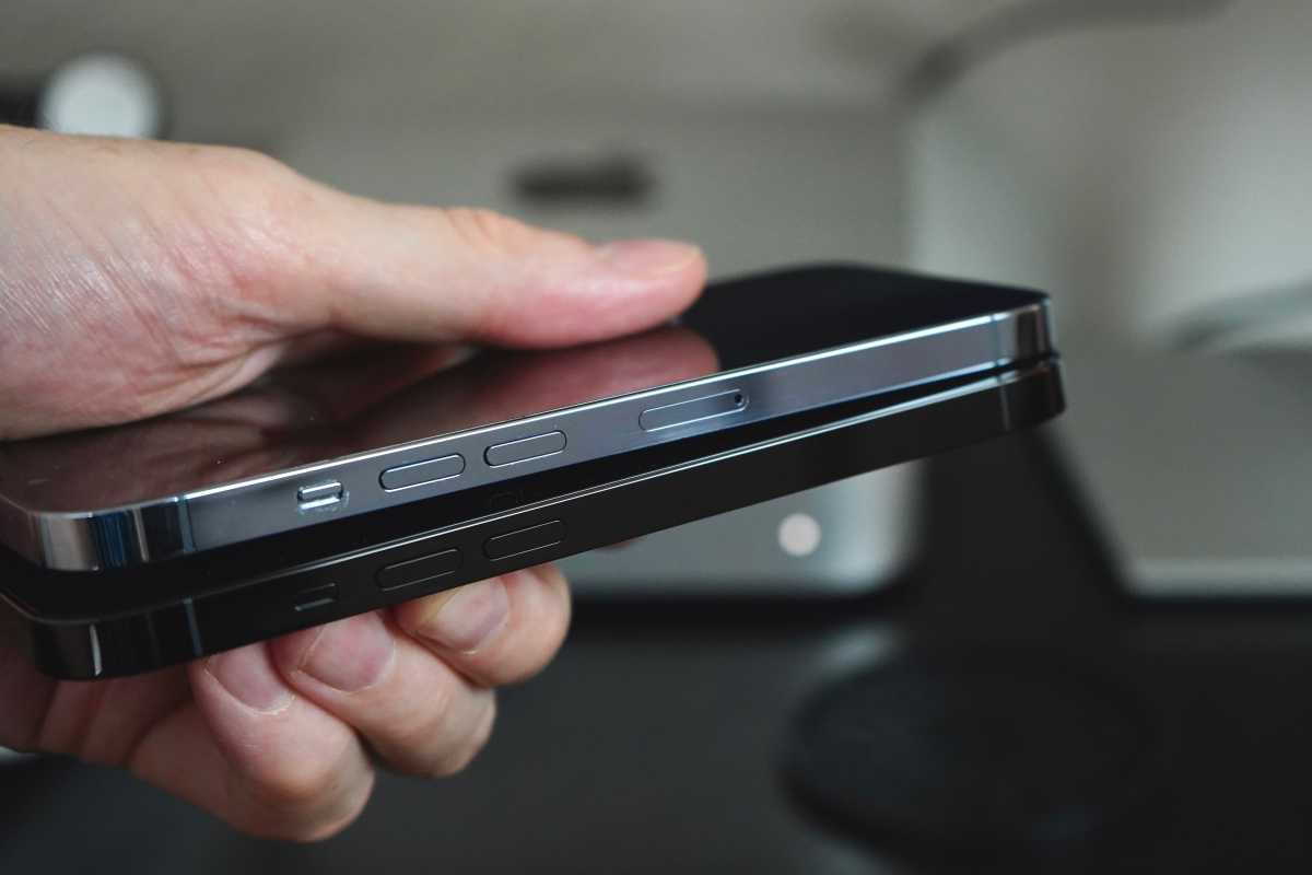
Another change is the aggressive push to eSIM (a built-in, modifiable software SIM card). Past iPhones have supported eSIM, but still had a tradition SIM tray for nano-SIM cards. That’s still true in most of the world, but in the U.S. the iPhone 14 and iPhone 14 Pro will only support eSIMs–the physical SIM tray is gone. If you buy new phones from a carrier, this will be pretty seamless. If not, you may have to take an extra step to port over your number during the setup process. There’s some argument over whether eSIMs are good or bad for frequent travelers, because it may make it difficult to get a new SIM in some countries. This move will probably hurry along adoption and be a good thing in the long run, as eSIM is more secure (nobody can steal your SIM card) and it’s a lot easier to quickly sign up for and activate new carriers or temporary prepaid service with eSIM.
Foundry
The iPhone 14 (standard and Pro) both use Qualcomm’s Snapdragon X65 modem, which delivers slightly better 5G performance and uses a little less power. They are also the first iPhones to support Bluetooth 5.3 (earlier models support Bluetooth 5.0), though Apple doesn’t yet appear to be doing anything to take advantage of the new standard yet.
There are new, more sensitive accelerometers, which currently have no particular use other than being used to automatically detect whether or not you’re in a car crash. If you are, you’ll be asked if you are okay and emergency services (and your emergency contact) will automatically be notified if you don’t respond. It’s a great safety feature, but one I’m definitely not going to deliberately test.
The iPhone 14 Pro is the first iPhone to feature dual-band precision GPS, a feature also found in the new Apple Watch Ultra. This is not available in the standard iPhone 14, and should make GPS far more precise in urban areas with tall buildings.
The future of iPhone begins here
Most iPhones are better than the year before, because they have faster processors and better cameras, and usually bring other small improvements like a better display. It’s typically not worth upgrading from last year’s model, but that’s fine–the point is to make a better iPhone every year for people upgrading from their older models.
This year, while using the iPhone 14 Pro, I get a sort of gut feeling that it’s the start of something, that what I’m using isn’t just the next quality or performance upgrade but a larger shift in the paradigm of how we use our iPhones.
The Dynamic Island feels like the beginning of a new
chapter for the iPhone.
IDG
The always-on display won’t shine until we get Live Activities in an iOS 16 update later this year and then lots of apps are updated to use them. It’s fine for what it is now, but the potential to surface always-updated information without unlocking your iPhone is only partly satisfied by the time, date, and widgets. For another month or two, it feels like its missing a piece of the puzzle.
The Dynamic Island, on the other hand, is a slam-dunk already and will only get better after the launch of Live Activities. It’s one of those rare interface changes that adds capability while reducing complexity. It gives you the status of things your iPhone is doing in the background, like a phone call, playing a podcast, or running a timer. It gives you rapid, intuitive access to basic controls for those things, and one-tap access to the app in question. But it’s use as a place for status “toasts” (like your AirPods connecting or Face ID authenticating) and live background activities is very clearly defined; this isn’t just a place to put all your notifications in a differently-shaped bubble.
Apple would be wise to bring it to as many iPhones as possible as quickly as possible. It will undoubtedly be expanded upon in future iOS versions and copied by Apple’s competitors. It has the potential to be one of those things that defines the iPhone experience, and could even prove useful on the iPad and Mac. I don’t think it’s worth spending $1,000 or more to upgrade your iPhone just to experience the Dynamic Island, but it’s a surprisingly huge benefit that, this year, distinguishes the Pro even more than the A16 processor, always-on display, or 48MP camera.

