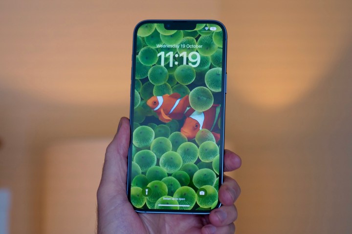
For many years, the home and lock screens for Apple’s iPhone largely remained unchanged; that is, until iOS 14 and iOS 16. With iOS 14, users were finally able to do some home screen customization by using custom app icons through the Shortcuts app. iOS 16 spruced up the lock screen with a few personalization options, as well as adding widgets.
One of the cool things about iOS 16 lock screen customization is the depth effect that you can apply to most photo wallpapers. Here’s how to add some depth to your iOS 16 lock screen with just a few taps!
Joe Maring/Digital Trends
How to get the depth effect on your iOS 16 lock screen
The depth effect on the iOS 16 lock screen can work with pretty much any image, not just Portrait mode images. The image also doesn’t necessarily need to be a photo that you took — even images that you’ve saved from elsewhere on the internet can be used with the depth effect, though the end results may vary, as some images work better than others.
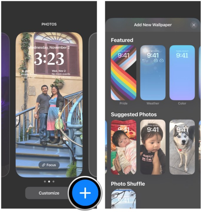
Step 1: On the lock screen (when unlocked) press and hold anywhere on the screen to bring up the lock screen picker.
Step 2: Tap the Blue plus sign button to add a new lock screen.
Step 3: Tap the Photos button to find an image you want to use for your wallpaper or tap one of the suggested photos.
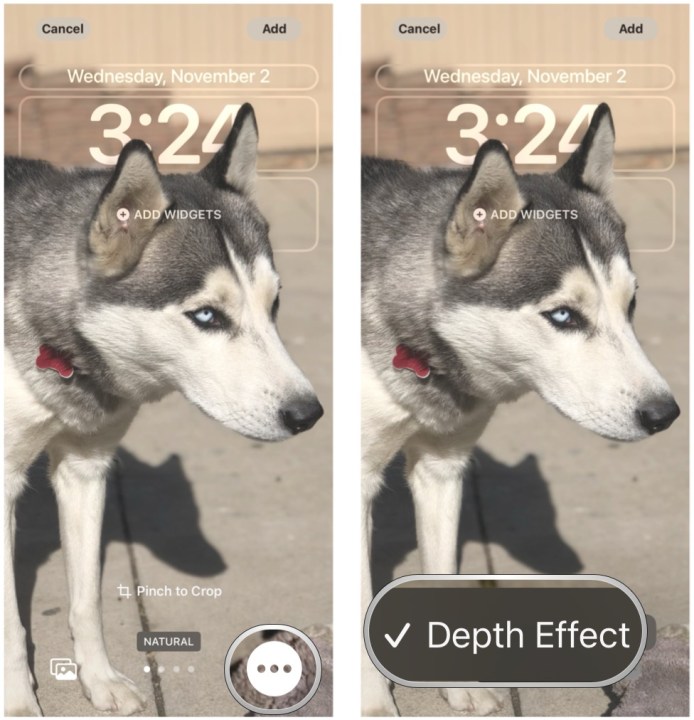
Step 4: If necessary, use multitouch gestures to pinch and pan the image around to crop it for your lock screen.
Step 5: Select the Three-dots button in the bottom right and make sure Depth effect is selected for the effect to happen.
Step 6: Optionally, if you want to change the filter on the wallpaper image, swipe left and right to go through the available options.
Step 7: Tap Add to add that lock screen to save it.
Tips to make the depth effect look great
Not all images will work with the depth effect on the iOS 16 lock screen. For best results, we recommend an image that has a clearly defined subject in the foreground and one that you can easily line up with the time widget.
If an image is already too zoomed in when setting it as wallpaper, it won’t work well because you can’t zoom out. You also can’t zoom too far in, as that will remove the depth effect. It’s a fickle beast, so even though it’s supposed to work with any image, your mileage may vary.
Another important thing to note is that if you decide you want widgets on the lock screen, the depth effect is automatically disabled. So, you have to choose between having an informative lock screen or one that looks cool with depth. It’s a silly limitation imposed by Apple for some reason, but that’s just how it is. If you end up with too many lock screens because of this, don’t worry! You can also delete lock screens if you change your mind.

Andy Boxall/Digital Trends
Making your lock screen cool again with iOS 16
The depth effect is a great little touch for lock screen customization with iOS 16, and it’s great to see it as an option. Even though it’s not perfect, with the ability to have multiple lock screens to choose from, it’s great if you want to keep things simple.
Editors’ Recommendations


