At a glance
Expert’s Rating
Pros
- Sleek but ergonomic design
- Intuitive clickpad
- Better button placement
Cons
- Overpriced
- No Find My support
Our Verdict
The price is hard to swallow, but the new Siri Remote is such an improvement over the prior one that you almost have to get it.
Price When Reviewed
59
Best Prices Today
US$59

–
If you already have an Apple TV 4K, it’s not worth replacing. Sure, the second-generation Apple TV 4K can playback 4K HDR content at 60fps, but there’s not much need for that yet. And there’s eARC support, too. If you’re an edge case where those features really matter a lot to you, you might consider buying the new model.
For everyone else, just hang on to the Apple TV 4K you’ve already got. (If you have Apple TV HD, however, it’s probably time to upgrade). The Siri Remote, on the other hand, may be worth your money. You can buy it alone for $59, and it works with existing Apple TV HD and 4K units. That price tag inspires a bit of sticker shock for a fairly simple remote, but it really improves the usability of Apple’s streaming hardware.
Bigger, but still little
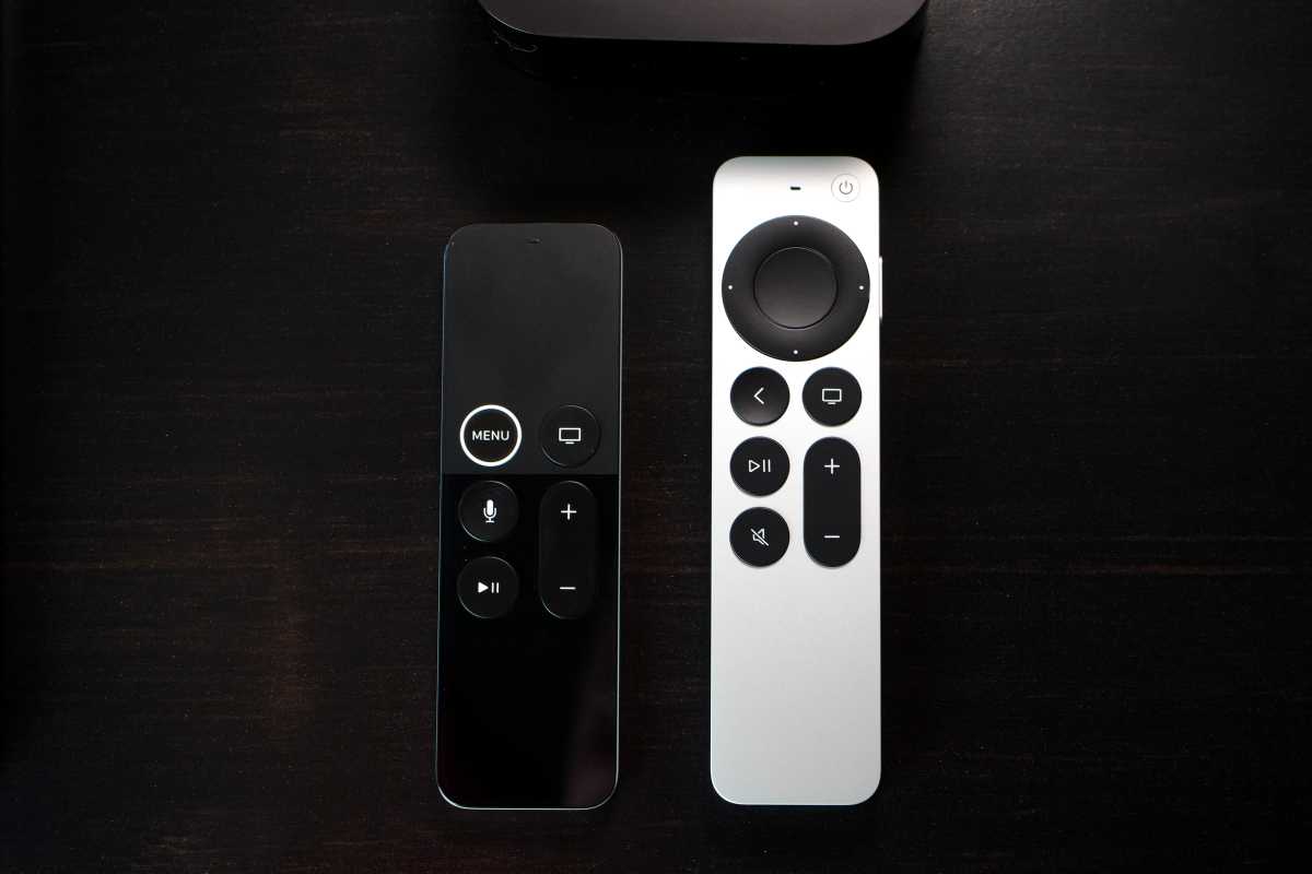
The old Siri Remote was absolutely tiny. At 4.8 inches tall and a quarter-inch thick, it sort of got lost in your hand. Worse, it was so symmetrical, with all the buttons right in the middle of two flat areas, that you’d often accidentally hold it upside down. The upper area was an edge-to-edge clickable touchpad that felt just like the blank lower area, seemingly designed to encourage as many accidental taps and swipes as possible.

Jason Cross/IDG
The new design takes some design cues from the old 2nd-generation Apple Remote. Just a half-inch taller and a little narrower, it’s still quite small. But that half inch makes all the difference. Together with the asymmetrical controls on the face, it’s now easy to use without looking—a critical feature of any remote.
Navigation made easy
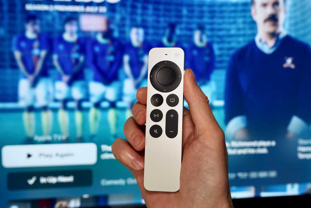
Gone are the accidental taps and swipes of the old click pad. The new Siri Remote has a circular, touch-sensitive D-pad with a clickable touchpad in the center. You can still swipe around as needed, but streaming apps often have interfaces that are built around discrete up/down/left/right commands because that’s what every other platform in the world uses. Those apps were a chore to use with the old Siri Remote, and now they just feel right.
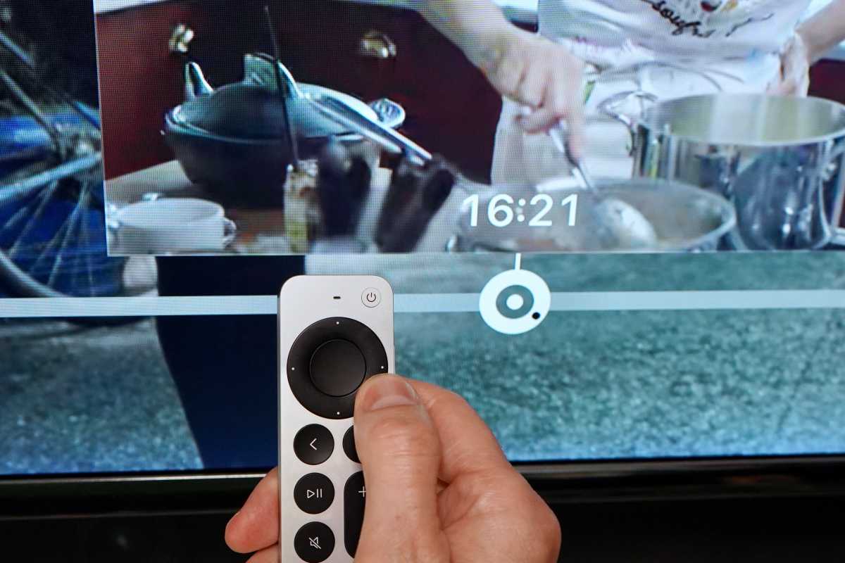
Apple’s also got a new scrub feature that’s sort of hit-and-miss. If you pause a video, then touch the navigation circle and hold for a second, you’ll notice the seek bar will get a round “jog dial” icon. Now you can run your finger around the circle to scrub through the video. It feels like using the old iPod click wheel and is a great way to both get where you want to be quickly and precisely. There’s a good reason professional editing stations often have jog dials, after all.

Jason Cross/IDG
But it doesn’t work all the time. I had no problem engaging it in any content streamed from the TV app, Hulu, or Netflix, but apps with their own playback interfaces such as Peacock or YouTube don’t work with it yet.
The Menu button is now the Back button, but it’s just a naming change, not a change in function. (Menus really ever popped up when you hit the Menu button, after all.) However, Apple TV apps are a little inconsistent about what they do when you hit the Back button. Some take stop playback and back you up a step, others clear away interface elements without stopping playback, and you can never quite tell when you’re going to back out of an app or just back up to a higher-level interface. This has always been an issue, and Apple could stand to enforce some standards a little better now that the button is specifically labeled, but it’s hardly the remote’s fault.
New buttons in new locations
The new circular direction-pad-and-click-pad is a huge improvement, but the addition of a couple new buttons helps a lot, too.
There’s now a power button in the upper right, flush with the face so it’s hard to accidentally press. Hold it down for a couple seconds to put everything to sleep and turn off devices controlled by HDMI-CEC. You could always hold down the TV button for a couple seconds to bring up control center and then choose Sleep, but this is faster and easier.
The new Mute button is a long-overdue addition. Apple reasoned that people used to watch on-demand video and just pause it, but live streaming video (or music) is nothing new, and adding a mute button is a years-overdue correction.
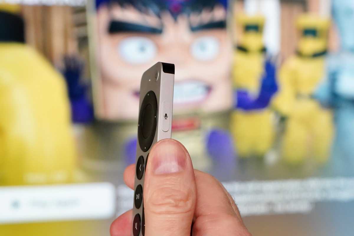
The Siri button has moved to the right edge, placed high but still within easy reach, so using it is similar to holding the side button on your iPhone. It’s more natural and less prone to accidental activation.

Jason Cross/IDG
It’s not all new functionality—some of the old features are gone. The old Siri Remote had an accelerometer and gyroscope sensor that was used in a handful of games. The new one gets rid of those, but they probably won’t be missed. More frustrating is the lack of Find My support. It makes some sense why Apple wouldn’t want the extra expense of putting a U1 chip in the remote, but it’s got Bluetooth 5.0. There’s no reason it couldn’t have Find My support if only to make a chirp so you can realize you absentmindedly left it in another room, or that it slipped into the couch cushions.
Overpriced, but still worth it
Let’s face it, $59 is too much for this remote. An entire Roku Ultra is just $10 more than that!
But unless you have a high-end programmable remote like a Harmony, the Siri Remote is likely your one and only way of interfacing with the Apple TV hardware. It’s so important, and the old Siri Remote is so bad, that it’s worth considering an upgrade to this new one.
I have written professionally about technology for my entire adult professional life – over 20 years. I like to figure out how complicated technology works and explain it in a way anyone can understand.

