Starting this week, Prime Video users in the United States and the rest of the world should see numerous changes coming to the service on connected room devices, including Fire TV and Android app. Unfortunately, iOS users have been left out from the initial rollout, but so were those who prefer the Web app. Amazon said the new redesign will be coming to iOS and Web at a later date, but no window frame for the release has been revealed yet.
The ‘Continue Watching’ row on redesigned ‘Home’ page
The main highlight of the redesign is the simplified main navigation menu, which is more accessible. For the living room apps, the new navigation menu has been repositioned to the side of the screen for improved access. The new Prime Video app will now launch with six primary pages: Home, Store, Find, Live TV, Free with Ads, and My Stuff. Multiple sub-navigation option will be available to users, including “Movies,” “TV shows,” and “Sports” on Home, and “Channels” or “Rent or Buy” on Store.
A more consistent Sports experience
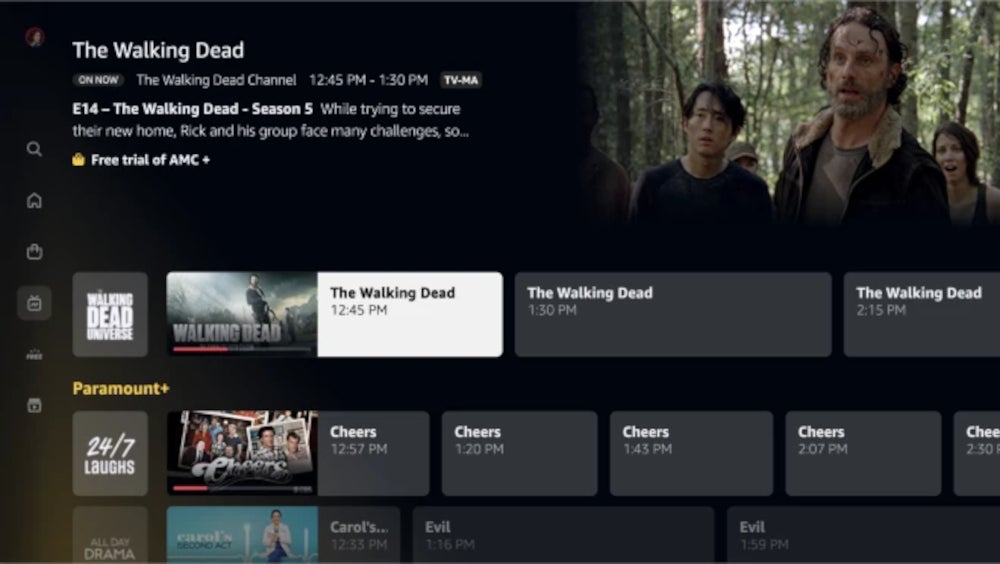
Additionally, the new Live TV page will now function as a hub for streaming stations, including live sports and events. The Sports sub-navigation menu will adopt a more cinematic experience featuring dedicated carousel to present leagues and teams of interest to the user. Expect the new sports page to feature additional content and sports documentaries, as well as replays and popular sports videos.

New Live TV page
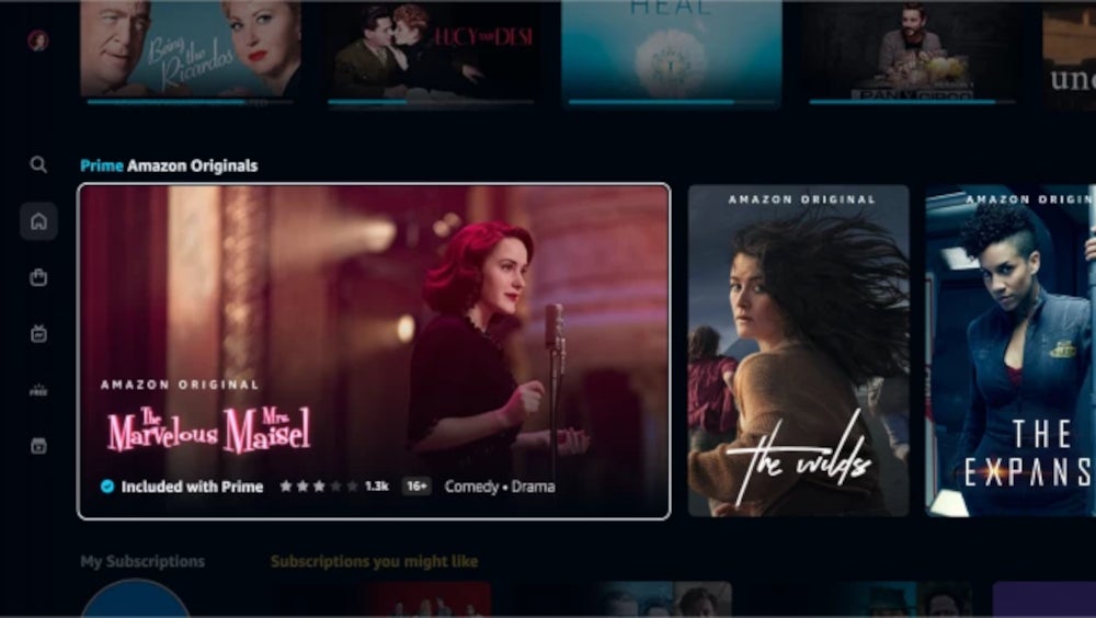
More importantly, the Prime Video app will now feature a new carousel that only shows videos with richer and more cinematic imagery. The so-called “Super Carousel” allows featured titles, such as Amazon Originals and Exclusives and Prime Video Cinema, to stand out against all other titles.

New ‘Super Carousel’ makes it easier to find featured titles
Prime membership content is clearly marked
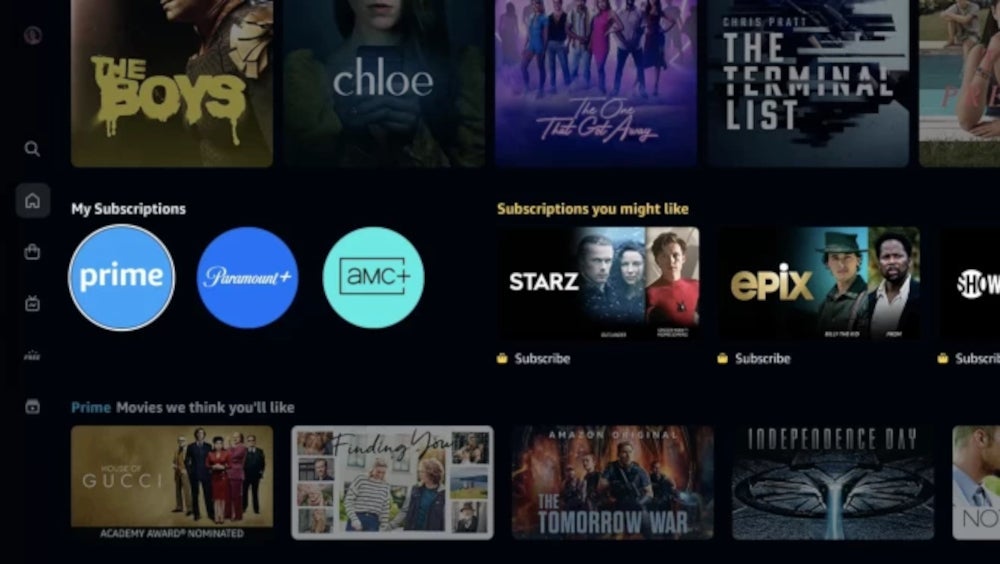
Something that we’re sure many users have been waiting for – more clear marking of content included in the Prime membership, has finally made its way into the recent update too. New visual cues have been introduced to clearly indicate which videos are included with your Prime membership and which are available to rent, buy, or subscribe to. The former are marked with a blue checkmark icon, whereas the latter are marked with a shopping bag icon. Furthermore, Prime Video users will be able to access all videos included with their membership much easier from within the My Subscription row, near the top of Home.

New color palette and search experience
A new redesign is certainly not limited to reshuffling some menus and the addition of new features, so expect a new color palette too. Also, the app’s new carousels will now showcase titles in a way that makes the experience smoother and more immersive.
To top it all off, Amazon has also redesigned the “Find” page to make simpler to search your favorite TV shows and movies. It’s now possible to search for a specific title or explore difference genres and even collections. Not to mention that search suggestions will make the search experience even smoother. These can easily filter results by genre or 4K UHD content.
Another interesting change involves new visual cues for search results, which make it more clear which videos are included in your Prime membership and which are available to rent, buy, or subscribe to.

