Long gone are the days when mobile game graphics struggled to keep up with the rest of the industry. Today’s mobile games are able to showcase high level graphics and unique art styles. And with many gamers often judging a game by its looks before jumping in to play, having a well crafted art style is an early way to entice potential players.
But creating a game that not only plays well but looks the part means many hurdles to cross. In this guest post art director at Azur Games, Anastasia Dovletova shares the artistic process behind midcore mobile title Railroad Empire from initial concepts and 2D designs, to sourcing inspiration from historical blueprints, all the way to 3D modelling.
In today’s mobile gaming market, amidst noticeable stagnation, graphics quality has become as crucial as gameplay and balance. This rings particularly true for midcore and casual games, where players have much higher expectations for visuals than in hypercasual titles. Developing such games demands not just deep expertise but also a hefty investment of resources.
But despite these challenges, we’ve positioned this sector as one of our top priorities, noting that midcore and casual titles tend to perform more consistently in market dynamics than their hypercasual counterparts.
I want to share our journey in crafting art content and establishing a workflow that elevates the potential success of a midcore project.
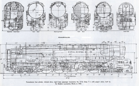
When we embarked on the Railroad Empire project, we hadn’t settled on a specific style. Our initial approach wasn’t tethered to realism or confined within strict stylistic borders. Instead, we leaned on two pivotal factors:
- The team’s resources and expertise.
- Understanding our target audience’s preferences.
Our research revealed a fascinating insight and that’s that many train enthusiasts also adore railway dioramas. These detailed, accurate miniatures capture the essence of trains with stunning realism. In a landscape where first impressions can make or break such a resource-consuming project’s success, overlooking the audience’s affinity for detail and realism would have been a grave oversight.
Armed with this insight, we committed to crafting a visual representation that was as realistic as possible. Every component and detail in our trains was designed to resonate logically and naturally with our audience. We embarked on this ambitious endeavour by drawing inspiration from historical blueprints and black-and-white photos, all while adapting to the unique demands of mobile gameplay and display.
From blueprints and concept art to 3D
Just as in AAA projects, our design process kicks off with a 2D concept. This stage is critical, as it involves deep dives into research to ensure our art reflects historical accuracy and authenticity. Every train in Railroad Empire is modelled after a real-life counterpart.
We immersed ourselves in historical research, scouring archives, engineering drawings, old photographs, Wikipedia, and specialist literature to achieve this. This wasn’t just about historical accuracy; it was about integrating essential technical details, such as the mechanics of the wheelbase drive, right from the start.
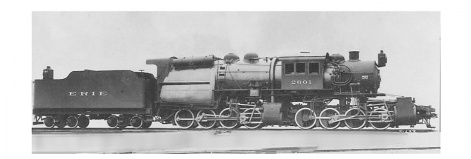
Creating initial sketches from these historical references is more than just replicating a photo. The real challenge lies in adapting these references for mobile gameplay, where readability and performance are paramount. Our goal was to ensure that the distinctive silhouettes and key features of different trains were clearly visible and engaging for players.
The game’s perspective required us to rethink realism for gameplay’s sake. For instance, the top-down view made the train wheels almost invisible, potentially losing the intricate animation of the mechanism. Our creative solution was to slightly exaggerate the size of the wheels and adjust the locomotive lengths for enhanced visibility and agility on the game map.
Our artists employ various sketching techniques, often starting with monochrome blocks of colour to quickly capture the essence of each train. While some might jump straight into 3D modelling, our focus remains on the speed and clarity of conveying the concept.
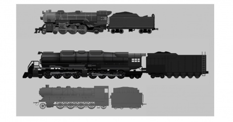
When we started production, we developed sketches for every model, each personally approved by the art director. Once we established a distinct set of stylistic features and formalised our art guide, we streamlined our process, skipping initial sketches and moving directly to detailed concept art.
This meant delivering references straight to our 3D artists with a defined set of angles – three-quarter, back, and side views. For intricate details or textures, we also include close-up callouts to ensure clarity and focus.
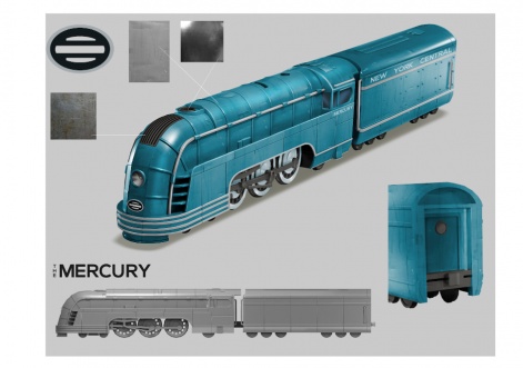
It’s crucial that, despite any adjustments to proportions, the distinct models within the game still reflect the variations between their real-life prototypes. Our 2D artists often create basic 3D models for comparison, allowing for a seamless blend of 2D and 3D techniques. This hybrid approach significantly accelerates the transition from concept to model, providing 3D artists with a ready-made blockout to work from.
While our goal during the concept phase isn’t to depict every single detail – like rivets and gears – due to the challenges of 3D modelling and performance considerations, we aim to evoke the essence of the original designs. We further focus on the physics of the drive mechanisms and the defining elements of locomotive and tender bodies, capturing the spirit and key characteristics of each train.
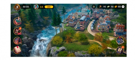
Colour choice also requires special attention which is pivotal for UX and visual storytelling. Each train model must stand out distinctly against the game world and other trains. Sometimes, historical accuracy in colours can lead to visual blending, obscuring the trains from players’ view.
To counter this, we explore vibrant visual highlights or alternative hues that keep the trains visually distinct while respecting the authenticity of each railway company’s palette for brand recognition.
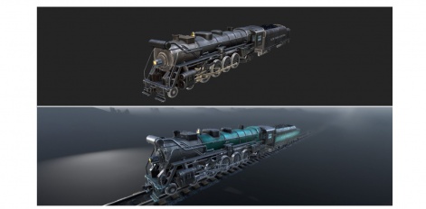
The refinement of material realism marks the culmination of our concept art process. It’s essential to accurately depict the varied textures of train surfaces, from the roughness of metal to the sheen of a fresh coat of paint. These details are meticulously planned during the concept stage, providing 3D artists with a comprehensive guide for every texture, ensuring the final model reflects the intended aesthetic.
Depending on the material’s complexity, we may fully texture a concept or provide zoomed-in references to guide the texture’s appearance on specific surfaces.
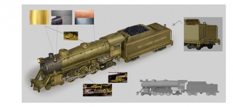
Our approach to 3D modelling follows a tried-and-true method, beginning with high-poly models, which are then approved and sent back for geometry optimization.
We develop two presets of each model: one detailed variant for close-up views, such as when a player acquires a new train, and a simplified version for wider map views with various polygon requirements applied. This dual approach allows us to adapt to the varying graphic capabilities of different devices, thanks to the game’s adjustable quality settings.
Post geometry optimization, we proceed with UV mapping, baking high-poly details onto the low-poly model, and initiating the texturing phase.
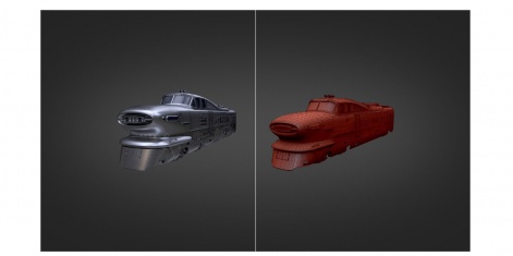
In crafting textures, our goal is to imbue them with a tangible sense of ‘materiality’, ensuring the visual and lighting intricacies of our locomotives align with their conceptual and real-world counterparts. Achieving this delicate balance between artistic expressiveness and the technical limitations of mobile platforms is paramount. While PC gaming often leverages PBR textures for lifelike realism, the computational demands are too hefty for mobile devices. So, we employ creative techniques to captivate users within these constraints.
To illustrate, we deconstruct textures into their RGB+A components. The alpha channel houses data on Specular properties, AO is integrated directly into the Diffuse channel, and the Normal map is kept separate. Besides that, we hand-draw the smallest details, adding a layer of artificial properties through colour.
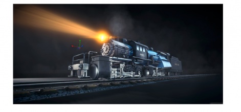
In refining the colours for our models, we adhere to a specific guideline: avoid the extremes of pure black and white. By excluding the brightest and darkest 10% of tones, we prevent the issues caused by lighting aliasing in our scenes. Pure black can obscure small details, while pure white might cause overexposure effects. Instead, we aim for a rich palette of mid-tones, ensuring a natural and voluminous appearance with detailed and physically accurate textures. The process is nuanced to the point where I could write a separate article about it, but the result always makes it worth the trouble.
Our research into historical materials goes beyond mere appearances; we delve into the locomotives’ operational dynamics. This includes understanding how smoke disperses, the intensity of the headlights, and even the occurrence of sparks during braking. Such details are crucial for the VFX team, who apply these effects post-integration of the 3D model into the game engine, adding a layer of uniqueness to each train and making it even more memorable.
It’s worth noting that the trains and historical landmarks scattered across the game map are modelled after real-life prototypes. While we afford ourselves a degree of creative freedom in this aspect, our goal remains to capture and preserve the essence and recognizable characteristics of each historical object.
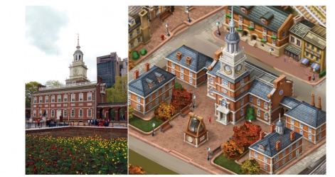
Yet, the endeavour spans beyond just crafting a visually appealing mobile game. It encompasses character development, marketing materials, ASO (icons, store banners), user interface design, and other elements beyond in-game artwork.
In the realm of casual and midcore projects, our meticulous attention to detail in visuals, gameplay, and polish means that, on average, one out of ten projects truly makes its mark. This single success story, evolving and gathering momentum over two to three years, compensates for the investments poured into the nine others, with total expenditures hovering around the $10-15 million mark.
Navigating game creation during economic slumps demands a relentless market analysis, a deep understanding of player expectations, and a clear grasp of the necessary resources to achieve – or surpass – a certain production standard.
In essence, modern mobile game development transcends the notion of rapid project completion. The processes we’ve discussed lay the necessary groundwork for a prototype that closely mirrors the envisioned final game, especially in its look & feel. It’s only after extensive development that the true potential of a project comes to light, with art standing as a critical determinant of its success.
Edited by Paige Cook

