Current phone camera islands are a looks and ergonomics fail
Ever since manufacturers began employing the holy trinity of camera features in their phones – main, ultrawide, and telephoto shooters – they started tucking them where there were only one or two sensors before.
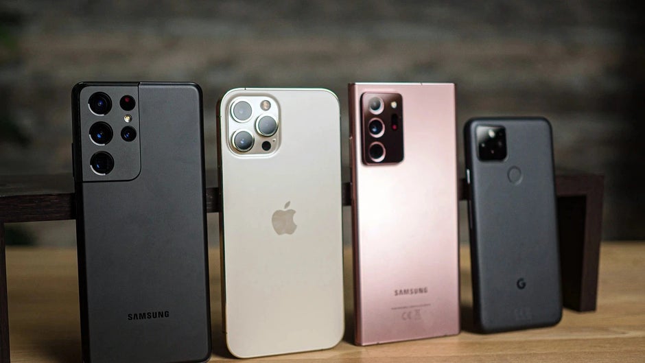
Yes, we are talking about the upper left corner of the back which with time started accommodating more and more sensors, lenses, flashes, periscopes, lasers, and infrared or even LiDAR cameras. This smorgasbord of components prompted the advent of the camera island on the back – an elevation that had to house all of a phone’s camera prowess while at the same time protruding significantly from the rear in order to keep the phone thin in the specs listings.
After Apple started employing those unsightly camera islands en masse even in midrangers that only had two cameras to speak of, other phone makers stopped having qualms about slapping one on the back, too, and now we are awash in a sea of lookalike handsets.
Aesthetics aside, the camera island in the top left corner is so ubiquitous, that people have gotten used to its bad ergonomics, always keeping their finger placement on the back of their minds when taking a shot, so as not to inadvertently snap a protruding phalange or two. That’s not to mention the framing perspective gymnastics one has to do with cameras tucked there, especially the ultrawide shots.
The freshness of the Google Pixel 6 camera design
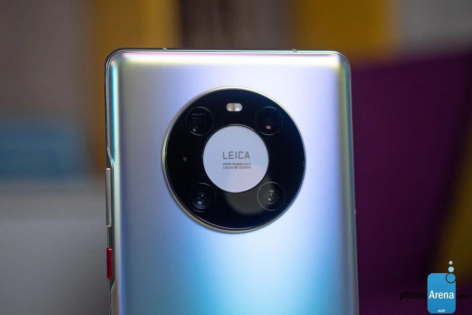
They answered that, even though the Mates are their technological and design playground, placing their rich camera kit in the middle of the rear is no harder than relegating it to the top left from an engineering perspective.
They just wanted to differentiate the Mates as something unique by using the signature circular lot for the cameras which is as beautiful to look at for its symmetry, as it is more practical from an everyday usage perspective. Goal achieved.
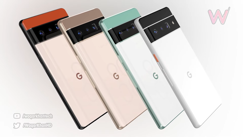
All of the Pixel 6 cameras and accompanying paraphernalia will evidently be placed in a strip across the back that asymmetrically splits the two-tone body. We can’t say that we have welcomed a phone design more in recent memory.
First, it is not just different for the sake of it. The neatly arranged sensor and lens combos can’t easily snap photos of your fingers or butcher the ultrawide perspective as a corner camera island would. Plus, there will be ample strip space for our index finger to press against while we use the phone with one hand.
Much more than with a large glass slab with a protruding camera corner, that is. When we add the expected high-res, high refresh rate display, and the huge battery, the Pixel 6 XL is actually shaping up to be the phone to look forward to most this fall, provided that Google’s second-to-none computational photography proves as good a triple camera as it is a single camera manager.
In a nutshell, even if no other manufacturer takes the Pixel 6 phone design cues, Google would have created a signature look for its handset line that will make them immediately recognizable. In a positive way, unlike Apple and its iPhone notch or baren camera islands. What do you think?


