
Previously, these menus were just a long list of text, which could be a bit overwhelming. Now, Google has added icons next to each item, making it much easier to scan and find what you’re looking for. They’ve also added dividers to group related items together, which further improves the organization.
This change isn’t entirely new, though. Google actually made similar updates to the Gmail website back in October 2023. It’s good to see these improvements making their way to the Android app as well.
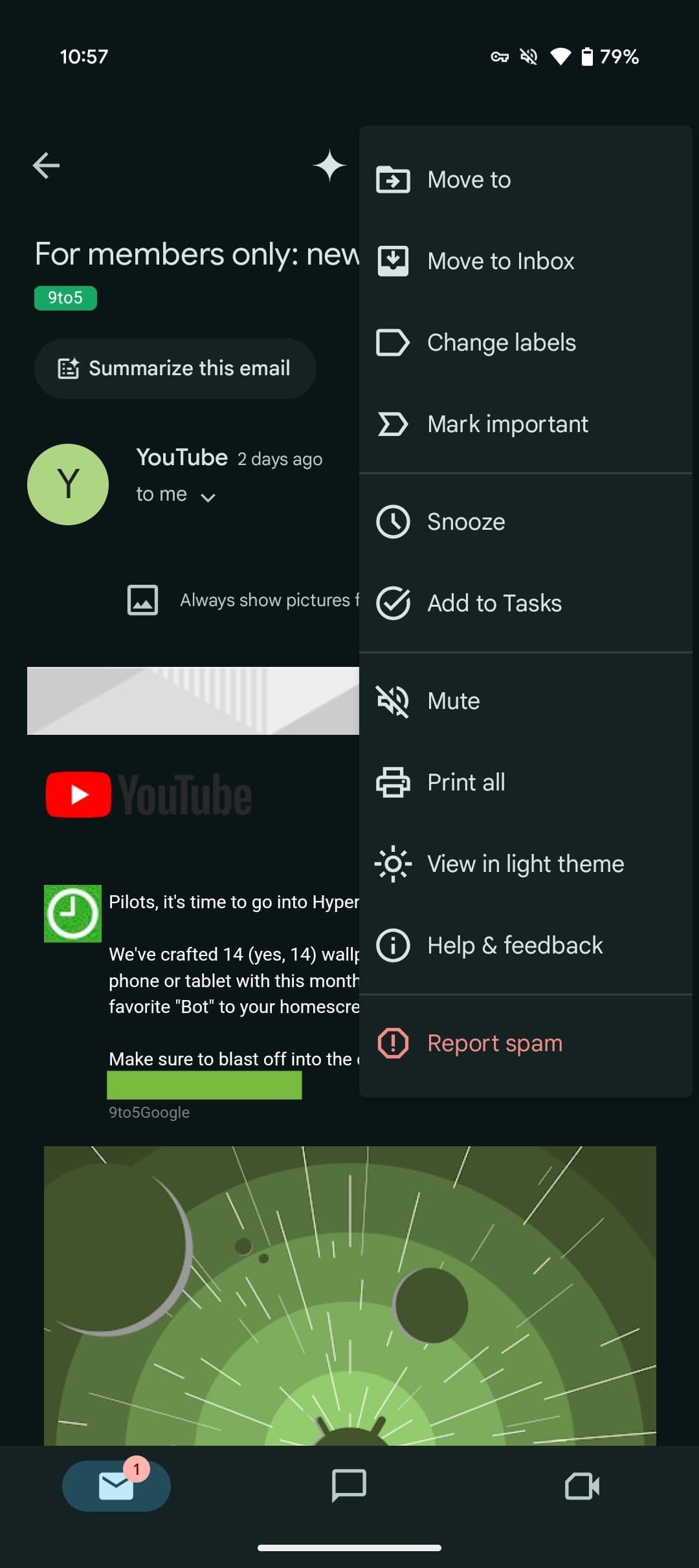
So, what exactly has changed? Let’s take the menu in the top-right corner of an email as an example. This menu now groups options like “Move to,” “Change labels,” and “Mark important” together. They’ve also moved the “Snooze” option and paired it with “Add to Tasks.” Other options like “Mute” and “Print all” are also present, with “Report spam” getting highlighted in red at the bottom.
The old version of Gmail on Android versus the new redesign. | Images credit — 9to5Google
The menu for individual messages within an email thread has also been updated, mainly with the addition of the “Report spam” option. Similarly, the menu you see in your inbox after selecting an email has been reorganized to group related actions together.These changes are all about making Gmail a bit more user-friendly. It’s often the little things that can make a big difference in how we experience an app, and this update certainly falls into that category. If you’re an Android user, you should see these changes in the latest version of Gmail (version 2025.01.25.721794537). If you’ve updated the app and don’t see the changes yet, try force-stopping the app and reopening it.
Personally, I find these kinds of updates quite helpful. I’m often on the go, checking emails on my phone, and having a more streamlined experience makes a real difference. It’s easier to find what I need and manage my inbox efficiently. It’s good to see Google paying attention to these details and making Gmail a more enjoyable app to use.