Google Chat — Google’s business-oriented messaging platform that is similar to Slack and Microsoft Teams — just got a big update for its Android and iOS apps. The update dramatically changes how you navigate the app and, uh, well, it sure is something.
Google Chat’s mobile app used to be broken up into two pages: Chat (direct messages between you and other users) and Spaces (larger chat rooms for multiple people). As with most apps, you switched between these with a navigation bar at the bottom of your screen.

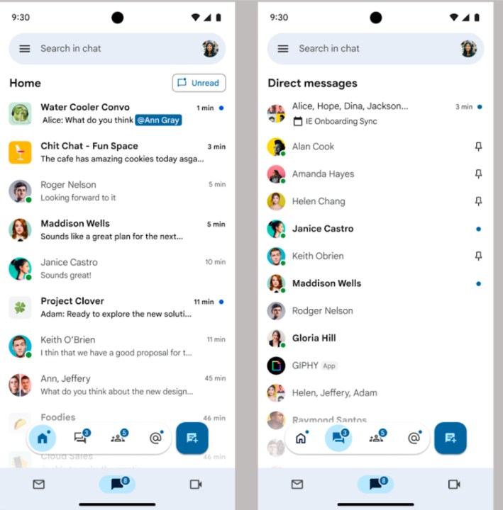
The new Google Chat app now has four navigation buttons. These include Home, Direct messages, Spaces, and Mentions. Plus, to the right of these is another new compose button that lets you quickly start a new message.
But that’s not where it ends. The screenshots of the new Chat app show what it looks like when you’re using Google Chat through the Gmail app. And with this setup, you effectively get two sets of navigation bars.

The four new buttons (plus the compose button) appear as floating bubbles above Gmail’s own navigation bar — which has three other navigation buttons. The hamburger menu is also still there in the top-left corner for more navigation options. This, dear reader, is not what I’d call organized. In fact, it looks pretty darn messy.
While this floating navigation bar is only rolling out to Google Chat, it does raise the question of whether this is something Google will implement in other apps down the road. Could we see a similar approach come to apps like Google Messages, Google Maps, YouTube, etc.? If it were to look anything like this, I sure hope not.
If you use Google Chat, Google says the redesigned app is rolling out for Android and iOS “over the next few weeks.”
Editors’ Recommendations

