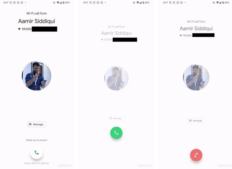
Currently, phones with the Google Phone app installed will show a button that needs to be swiped up to answer a call or swiped down to dismiss it. The new UI being tested features a two-button layout. The red button on the left with the icon of a landline phone handset has the word “Decline” underneath. On the right side is a green button with the landline phone handset in the position it would be held if you were on a call with the earpiece by your ear and the mouthpiece by your mouth. Underneath, you see the word “Accept.”

Current Pixel answer screen uses one button you slide up to accept or slide down to dismiss. | Image credit-Android Authority
You might not consider this a big deal as far as software design is concerned, but every little thing adds up when trying to compute the user experience of a phone.

