Let’s start with the new features
As much as we can appreciate a nice redesign and brand “modernization” effort, we’re fairly certain most “regular” Android users are primarily interested in what their phones can actually do now and couldn’t before today.
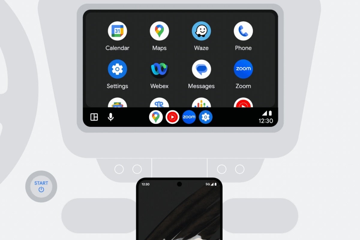
Probably the most intriguing and practical change unveiled by Big G to kick off autumn concerns your car rather than your handset, bringing (at long last) official support for Webex by Cisco and Zoom to Android Auto. The bad news, of course, is that you can no longer blame traffic for your lack of productivity or your absence from that super-important weekly team huddle, with Android Auto gaining the ability to start and join conference calls (by audio) and browse meeting schedules directly from your vehicle display.
The Assistant At a Glance widget on your phone, meanwhile, is getting a big update aimed at bringing you even more helpful information on your home screen, whether you’re using a Pixel or an Android device from a different brand.
And now the logos
Yes, the Android brand is being “overhauled” with a new logo that’s… different from the old one. Is this a change that will improve the user experience in any meaningful way? Probably not. Does the new logo look better than its predecessor? That’s arguably in the eye of the beholder.
Both the virtual Android “mascot” and the Android logo itself are subtly revised so as not to enrage the platform’s most hardcore longtime fans, nonetheless moving towards a more diverse and inclusive future with a few different, equally playful, and varyingly bold versions.
The capital “A” in Android is perhaps the biggest change we can report on this front, suggesting that the world’s most popular mobile operating system is done experimenting with all sorts of things and changes often affecting the users in negative ways. We’ll see if that proves to be the case out in the real world soon or not.