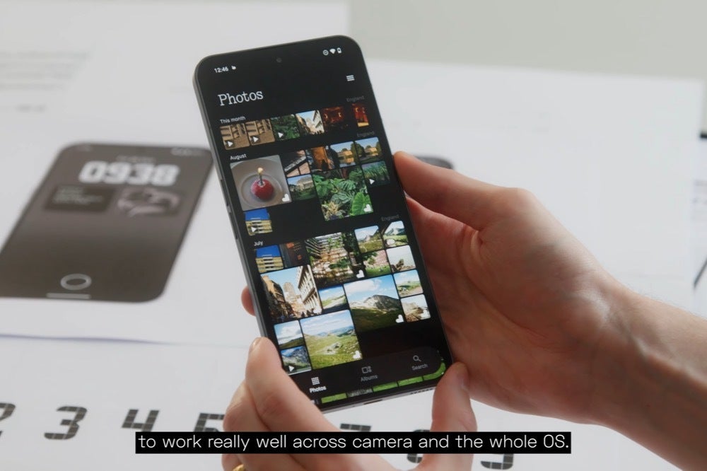
Nothing gave a tour of Nothing OS 3.0 starting at the 5:50 timestamp.
New features
- Dot animations: The animations throughout the OS are redesigned with a focus on high-frequency elements.
- Refined look and feel: The overall look and feel of the OS is refined with a new topography, an updated Sans Serif font, and a more tasteful use of the N-dot font.
- Dynamic dot matrix: The dot matrix is redesigned to be more dynamic. For example, it can be used to display weather icons.
- Transparency in the UI: The UI is redesigned to be more transparent, which allows users to see more data. For example, the lock screen is redesigned to allow users to see widgets and customize the clock face.
- Modular quick settings: The quick settings are redesigned to be modular and customizable. Users can choose which settings they want to see and how they want them to be displayed.
- Improved auto-brightness toggle: The auto-brightness toggle is now built directly into the brightness slider bar.
- AI-powered smart drawer: The app drawer is redesigned to be more helpful. It includes a new feature that allows users to pin their favorite apps to the top. The app drawer can also use AI to suggest apps to users based on their usage habits.
- Countdown widget: A new countdown widget is introduced. This widget allows users to track time towards a specific date.
- Shared widgets: A new feature is introduced that allows users to share widgets with their friends and family. This creates a “portal” between two phones, so that users can see each other’s widgets and interact with them.
- Nothing Gallery: A new gallery app is introduced. This app is designed to work seamlessly with the Nothing camera app. It features a faster transition time between the camera and the gallery, and faster processing times for complex edits. The gallery also uses AI to identify key moments in photos and to segment objects out of the background.
Screencaps of what the new Nothing OS 3.0 experience will look like. | Images credit — Nothing
A new Nothing Gallery app


Nothing’s new dedicated Gallery app will be out in beta in October. | Image credit — Nothing
The Nothing Gallery is a new gallery app that is designed to work seamlessly with the Nothing camera app. It features a faster transition time between the camera and the gallery, as well as faster processing times for complex edits. The Nothing Gallery will also use AI to identify key moments in your photos and to make it easier to find photos in the future. The Nothing Gallery will be available in open beta starting in October.
The general release for Nothing OS 3.0 will begin in December and the Open Beta will start rolling out in October. There was no mention of which Nothing Phone models will be eligible for the update, but I’m hoping that all models starting with the Phone (1) will be able to take advantage of the new UI and features. I’m also hoping that the CMF Phone (1) gets the OS 3.0 treatment, although I have a feeling not all the new features will be available for the budget line.

