series.
While previous One UI updates focused mostly on the performance and other tweaks, One UI 6.0 brings a big and much needed visual overhaul to the system. A new system font makes it look more modern, a new dropdown menu just makes more sense, and new emoji replace the outdated style with a more modern twist in line with all other platforms.
So let’s waste no time and dive right into what exactly has changed with Samsung One UI 6.0.
One UI 6.0 New Features
Here is an outline of the major new features you will get with the Android 14-based One UI 6.0:
- New and wider system font
- Completely redesigned emoji
- New Quick Settings dropdown menu
- More Lockscreen Customization options
- New Camera app UI
- New “i” button for easier access to picture details
- New look for the Weather app
- New Autoblocker feature in Security and Privacy menu
- Wave animation in media player
- Settings app tweaks
- New dedicated Battery page in Settings
- Improved Smart Select
New One UI 6.0 System Font
Samsung uses a brand new font in One UI 6.0 and this alone makes a big difference in the way you perceive the system. This new font is wider and not as condensed, and we find it easier on the eyes and a bit more spacious.
New Emoji
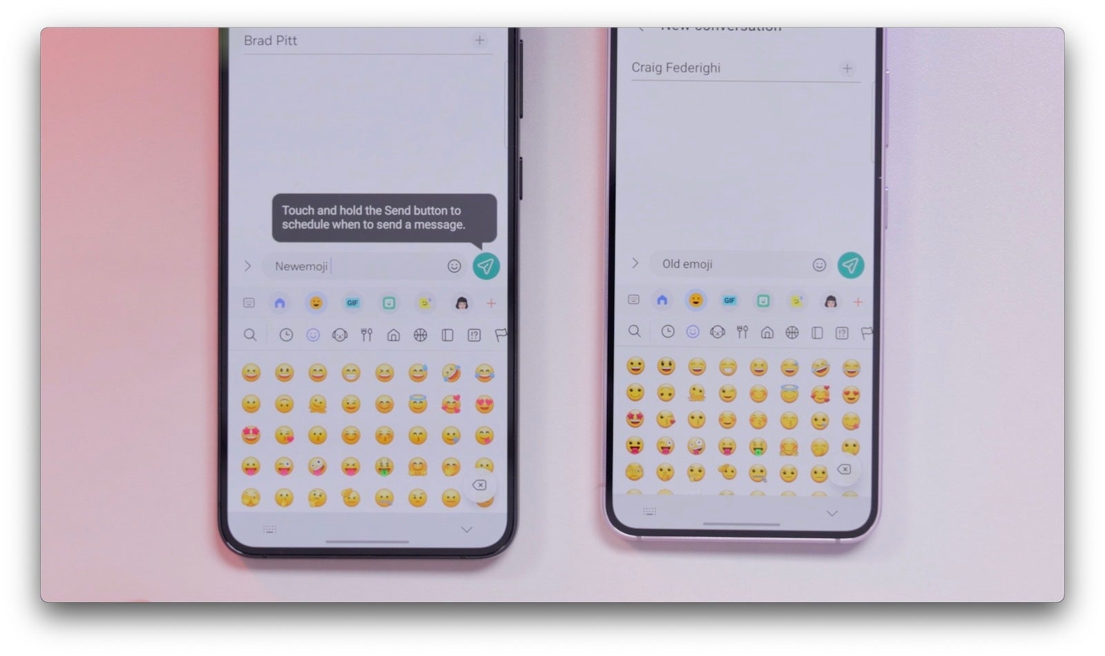
We wouldn’t like to use the word ugly, but the Samsung emoji were definitely not among the prettiest and they also used a very different style than emoji on most other platforms.
That’s why we were super happy to see Samsung has finally fixed this with a much better looking emoji style that will make texting just so much more enjoyable. It’s amazing how something so small as emoji can make such a big difference in daily use.
New Quick Settings menu
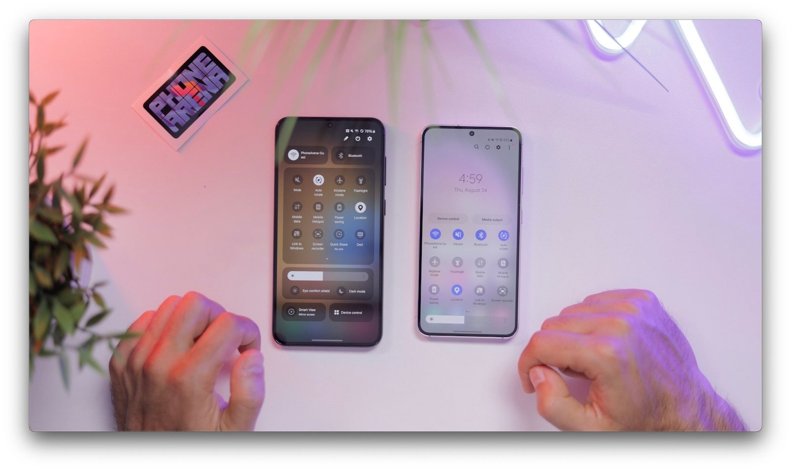
The new Quick Settings menu is divided in sections and more spacious than before. We like how the Wi-Fi and Bluetooth toggles are completely separate from the rest that you would probably use far less often. You can tap directly on the icon to turn the feature on and off, or you can tap on the text next to the icon to open additional options.
We also like that the brightness slider now appears even after one swipe down (previously, you had to swipe twice to reveal it). It’s also nice to get quick access to switch between dark and light mode right from the quick settings menu, and Samsung now even remembers little things like your Airplane mode configuration, so if you had Bluetooth enabled in Airplane mode, the next time you switch it on, it will be enabled. Cool!
Tap the pencil icon to edit the Quick Settings arrangement, and there you’d also find a neat quick access option where one swipe down from the top right brings you directly to the longer version of the quick settings menu.
Lock Screen Tweaks
You now have more options to customize your lockscreen. You can now move the clock anywhere on the lockscreen and you also have more fonts and styles to pick from.
Camera App Changes
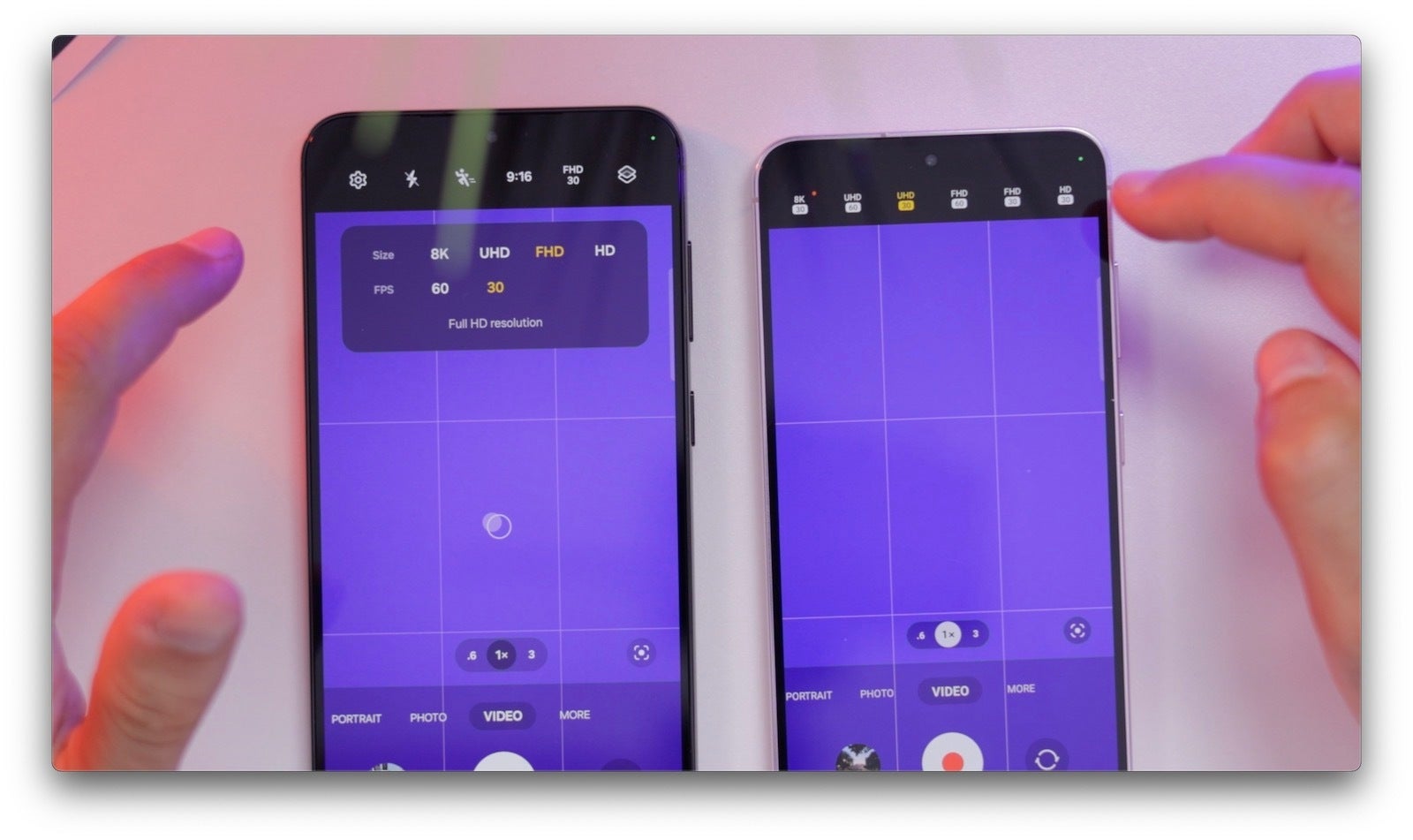
Samsung streamlines the Camera app interface in One UI 6.0 with a few small, but welcome changes.
In Video mode, you have a much easier way to select a resolution and frame rate.
Interestingly, when you tap on the gear icon in the camera app, you no longer see the “Scene Optimizer” on the first page, as it’s now hidden under the “Advanced Intelligence Options”, so obviously the idea is that for most people it should stay ON all of the time.
Under this tab, you can also find three new settings for image quality: “Maximum”, “Medium”, and “Minimum”, with maximum being the slowest and minimum the fastest for the least shutter lag, but do keep in mind that if you go for anything but “Maximum” the scene optimizer feature will not work.
Gallery Tweaks
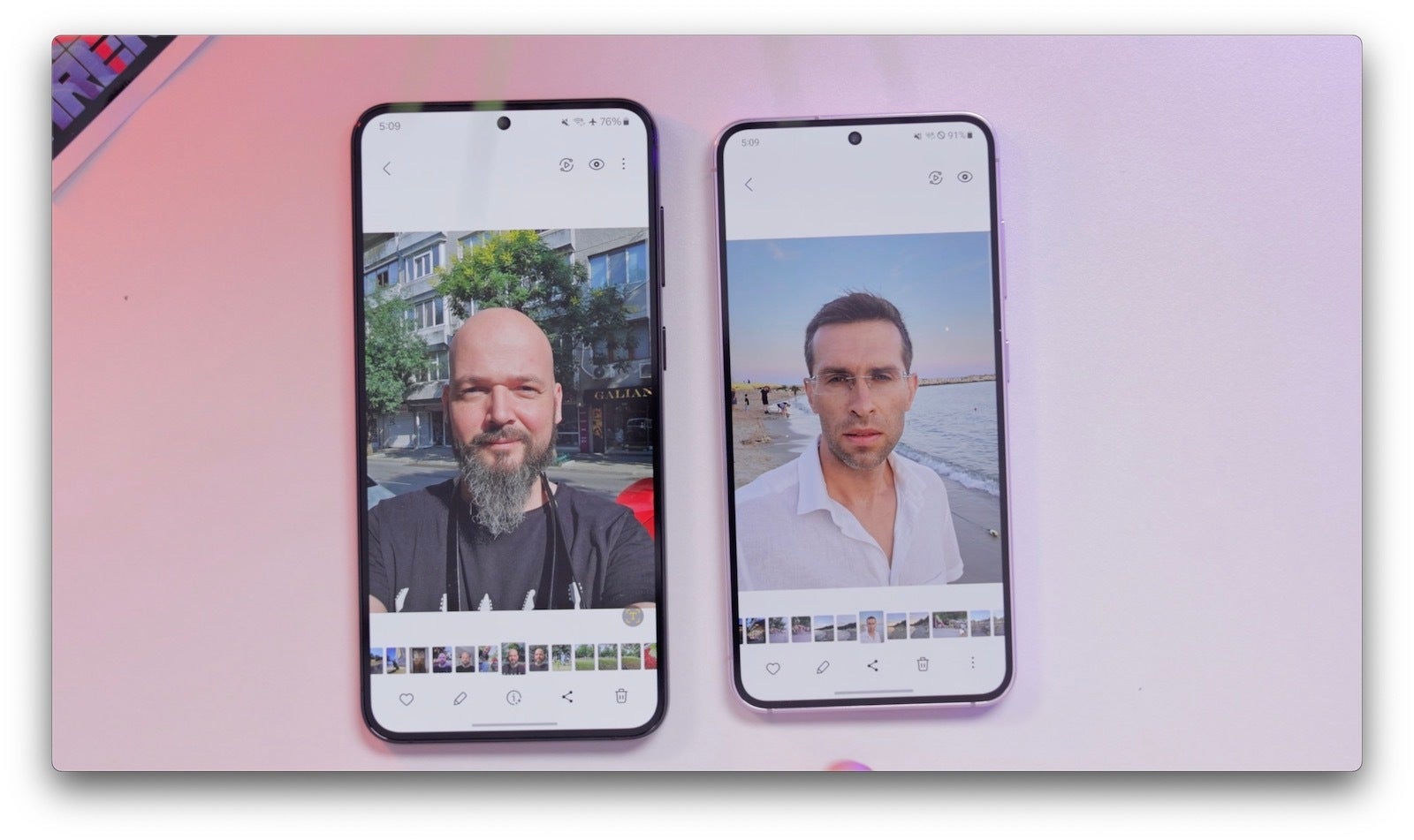
Samsung has also made a few changes to the gallery. When you open an individual photo, you now see an “i” button right in the middle (okay, Samsung might have stolen this idea from iOS). This makes accessing photo details easier. When you tap on the edit image icon, you now also see settings better arranged and for every change you make, you have an undo and redo buttons, great for image editing!
Weather App
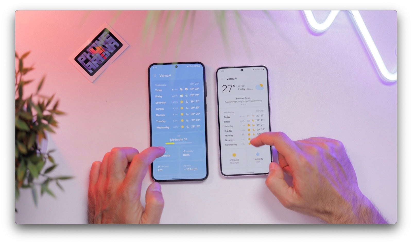
The Weather app is now richer and is now all blue, instead of the previous style where it switched to a white color after you scroll down past the first screen.
You now get larger sections for the sunrise and moon phases, and it all looks a bit better.
New Auto Blocker feature
You can find this feature under the Security and Privacy menu in settings, and it does a number of things to protect you. It will not allow apps from unauthorized sources, as well as do security checks on existing apps and block commands via ADB. This would be very useful for people who are not particularly tech savvy.
New Battery Page in Settings
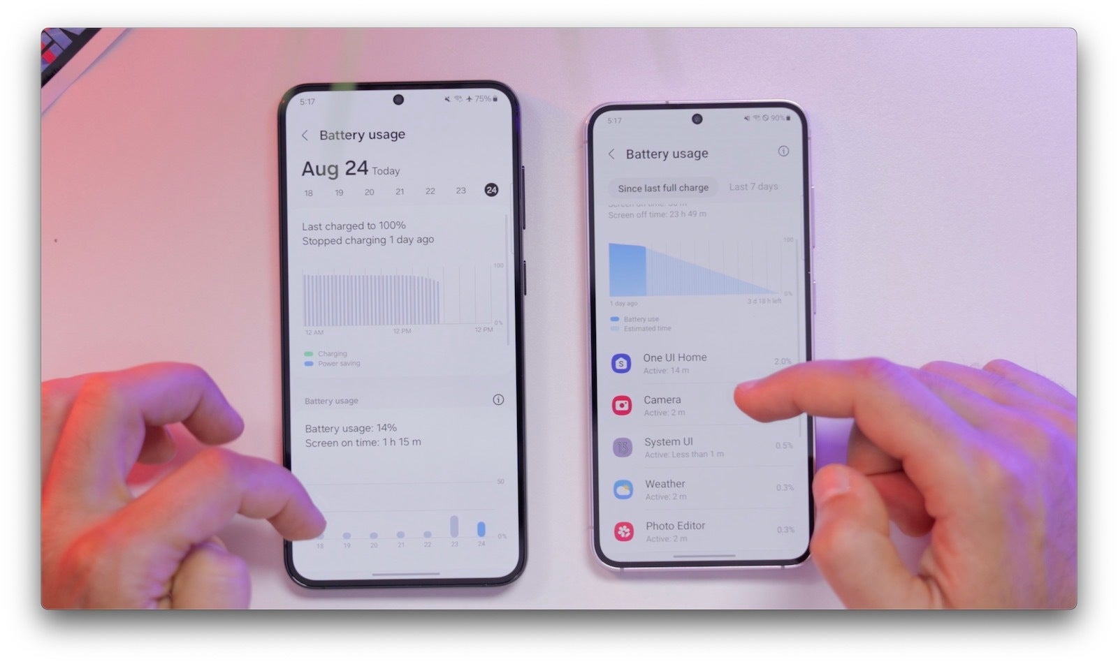
Samsung used to have the Battery page in the Battery and Device Care menu, and you had to tap a few times to access it, but now it’s right in the Settings home page and you can much easier see it.
It is also richer with a better design and you can easily see a ton of detail about your battery usage. We have to say that other Android phone makers really should take some notes here and especially Pixel phones where you have very limited battery reporting.
Better Smart Select
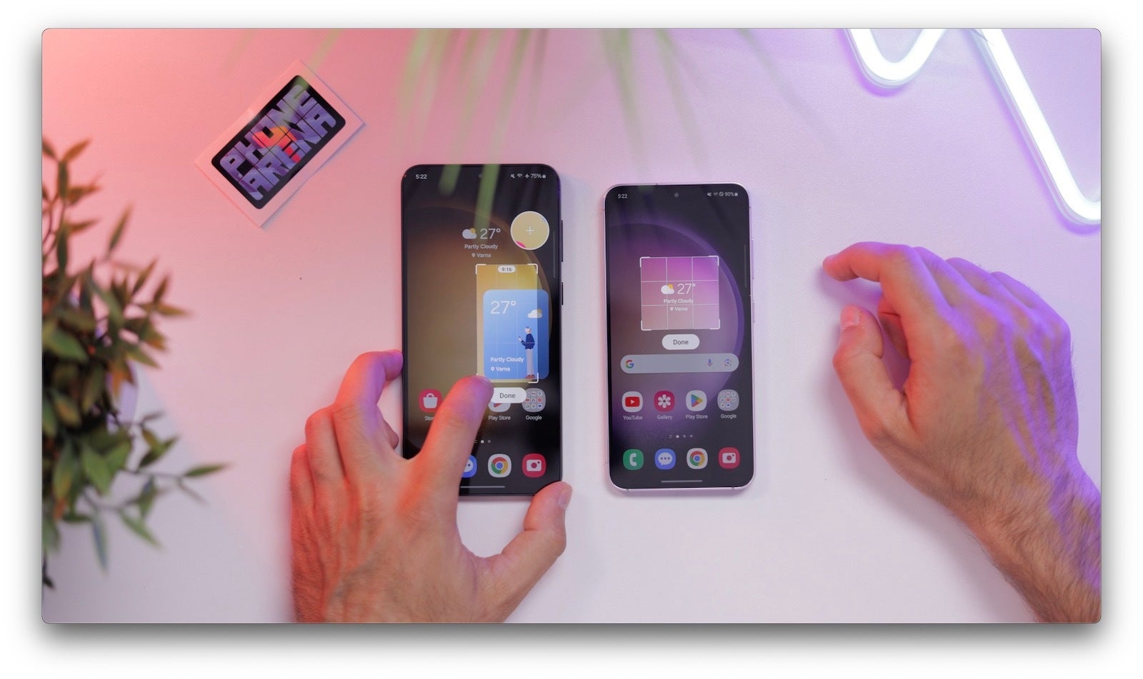
Going to the smaller features, we have the improved smart select, which is seriously underrated. Samsung now shows you the aspect ratio, and you see a magnifier that helps you make an extremely precise selection. This is just perfect and makes so much sense.
Waveform Animation for Music
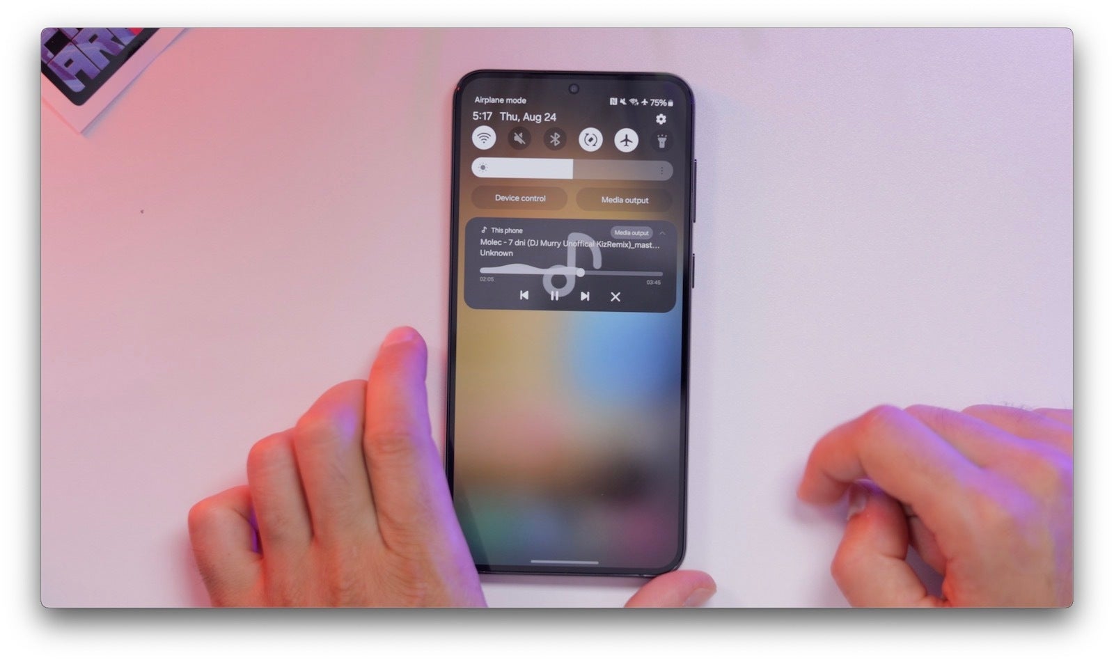
Speaking of small but cool new features, you get a new animated waveform while you play music and this indeed looks really cool.
When will my Samsung Galaxy phone get One UI 6.0?
The latest versions however will receive it earlier, so we expect the Galaxy S23 series to be the first to get the Android 14-based One UI 6.0 around October, with the Galaxy S22 and Galaxy S21 series expected to get the update by the end of the year (as per our projections, Samsung has not specified an official timeline just yet).

