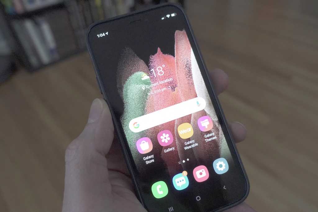
You won’t find it in the App Store, but if you want to test out Samsung’s One UI 3 OS on your iPhone, there’s a handy way to do it. Why anyone would want to is another question.
The web app, which was made by Samsung New Zealand, is actually pretty slick and does a good job of replicating a Galaxy phone experience, complete with notifications, themes, and incoming calls. The navigation uses the older bar rather than gestures, though Samsung does ship its phones with gestures turned off by default.
Tapping on menus and settings tabs doesn’t actually do the thing they’re supposed to do. Rather, they bring up little pop-up cards that explain what they would do on a Samsung phone. There are also fun little Easter eggs, like the Google bar going directly to a Samsung Galaxy S21 search.
Samsung iTest web app shows you would it would be like to use a Galaxy S21 on your iPhone.
IDG
I’m not exactly sure what this is trying to accomplish, however. Like the iPhone, Samsung phones are as much about the hardware as the software, with the design, display, and camera driving the experience, as well as the nuances of the respective interfaces. Otherwise, the foundation of Galaxy phones and iPhones are very similar, with apps, icons, and widgets peppering the home screen. I can’t imagine why anyone who uses this would come away with an informed opinion of Samsung’s OS or phones, let alone decide that they want to switch. It feels more like a slick gag app than anything, which is probably why it launched now and not on April 1.
You can try out the app using this link and downloading the Safari bookmark to your home screen.
Michael Simon has been covering Apple since the iPod was the iWalk. His obsession with technology goes back to his first PC—the IBM Thinkpad with the lift-up keyboard for swapping out the drive. He’s still waiting for that to come back in style tbh.

