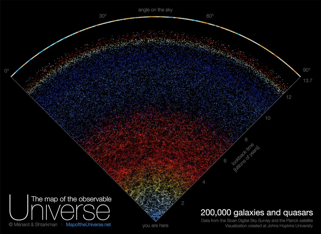
If you’ve ever wanted to bask in the cosmic majesty of all that exists or feel the existential horror of your own smallness, a new interactive map will show you the entire observable universe.
You can view the map at mapoftheuniverse.net, where you’ll find an overview of the types of objects which are visible and a timescale explaining how what is visible is related to its age due to the speed of light. If you’ve ever struggled to comprehend the relationship between time and distance in what is observable, this tool is helpful in showing that.
The idea was to make something accessible to the public rather than highly technical, the creators said. “Astrophysicists around the world have been analyzing this data for years, leading to thousands of scientific papers and discoveries,” map creator Brice Ménard, a professor at Johns Hopkins, said in a statement. “But nobody took the time to create a map that is beautiful, scientifically accurate, and accessible to people who are not scientists. Our goal here is to show everybody what the universe really looks like.”
The map uses data from the Sloan Digital Sky Survey, a project to create a 3D map of the universe using a telescope at Apache Point Observatory in New Mexico. Running in various forms since 2000, data from the survey has been used to study everything from how galaxies are distributed across the universe and where dark matter might be located to the properties of stars in the Milky Way.
Data from the survey covering a particular slice of the sky was used to make the map, which shows 200,000 galaxies, each one appearing as a small dot. Right at the very bottom of the map is a dot corresponding to the Milky Way.
“In this map, we are just a speck at the very bottom, just one pixel. And when I say we, I mean our galaxy, the Milky Way which has billions of stars and planets,” Ménard said. “We are used to seeing astronomical pictures showing one galaxy here, one galaxy there or perhaps a group of galaxies. But what this map shows is a very, very different scale.”
As well as visualizing the scope of the observable universe, the map also uses color to demonstrate the redshift of different galaxies, with more distant galaxies appearing redder because the expansion of the universe stretches the spectrum of light coming from them.
“Growing up I was very inspired by astronomy pictures, stars, nebulae and galaxies, and now it’s our time to create a new type of picture to inspire people,” said Ménard.
Editors’ Recommendations

