Your smartphone’s home screen is the heart and soul of your mobile tech experience — the launching pad for nearly everything you do on your device. And since you use Android, you’ve got a unique advantage over your iPhone-totin’ associates in that your home screen doesn’t have to be the same tired old grid everyone else is using. It certainly can be, if you want, but you also have the option to take complete control of that environment and turn it into a time-saving command center for your personal productivity needs.
We’re not just talking about sprinkling a few exceptional widgets into the mix, either (a privilege the Apple faithful can now also enjoy). With Android, you can install a completely new home screen launcher that lets you incorporate all sorts of custom actions, interfaces, and shortcuts into your device’s desktop — giving your phone a different look and feel and creating a system that’s custom-tailored to the way you like to get things done. It can make a current phone infinitely more useful and make an old phone feel new again.
The Google Play Store has plenty of commendable launcher options to consider, and figuring out which makes the most sense for you ultimately comes down to deciding what exactly you want to accomplish and what style of interaction you prefer. After spending time with all the top contenders, these are the Android launchers I’d recommend for serious professionals — broken down by what type of experience they offer and in what areas they excel.
Lawnchair: A Pixel-plus experience for everyone
Google’s Pixel phones are known for their standout software — and while Google itself no longer offers its home screen framework to non-Pixel owners, a team of third-party developers has stepped in to fill that void.
The Lawnchair launcher (say it out loud to get the joke) emulates the Pixel Launcher’s clean, simple, and visually pleasing foundation — but it doesn’t stop there: The app takes things a step further and offers all sorts of powerful possibilities the Pixel Launcher does not, including options to customize and control practically every facet of the home screen experience.
While there’s certainly no shortage of productivity-minded functions to be found, what truly makes Lawnchair stand out is how the app absolutely nails the balance between simplicity and power. It works perfectly well right out of the box, and even if you never so much as glance at a single advanced setting, it’ll give your phone a fresh, light, and delightful foundation that you’ll immediately appreciate, especially if you’re coming from a non-Pixel device (hi, Samsung pals!).
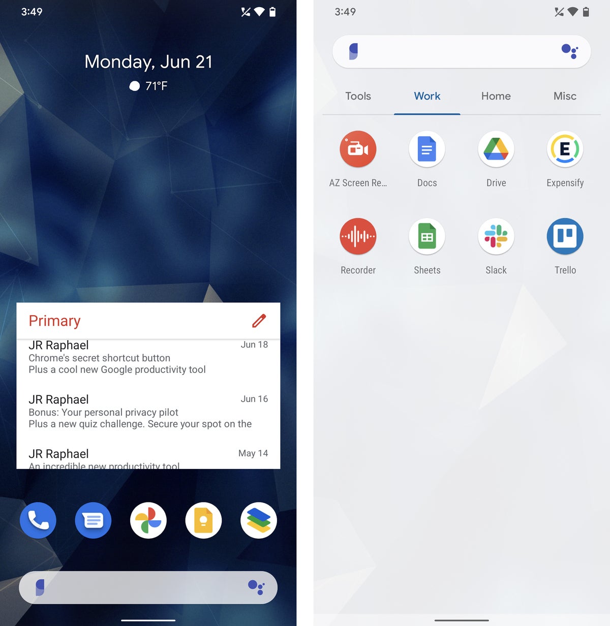
And if you do decide you want to take advantage of its more advanced options, you can do things like create a tabbed app drawer to separate your work and personal apps and implement an enhanced search system that’ll let you look through your contacts, calendar, and apps as well as search the web from a single streamlined spot.
 JR Raphael/IDG
Lawnchair brings a clean and simple Pixel-like interface to any home screen with lots of interesting extras — like the custom tabbed app drawer seen at right.
Lawnchair is completely free to use — and while you may notice that the app hasn’t been updated in some time (as of this writing), it still works admirably and without any issues. And a new major update is in the works and expected to be released soon.
In short: If you don’t have any specific needs and just want a simple and speedy home screen setup that looks great, works well, and gives you a Pixel-like experience with plenty of practical extras, Lawnchair is exactly what you need.
Sometimes, the simplest solutions can be the most effective. That’s the idea behind Niagara Launcher, which works to strip away all the extraneous elements of an Android home screen and leave you only with fast and fuss-free tools to get where you need to go.
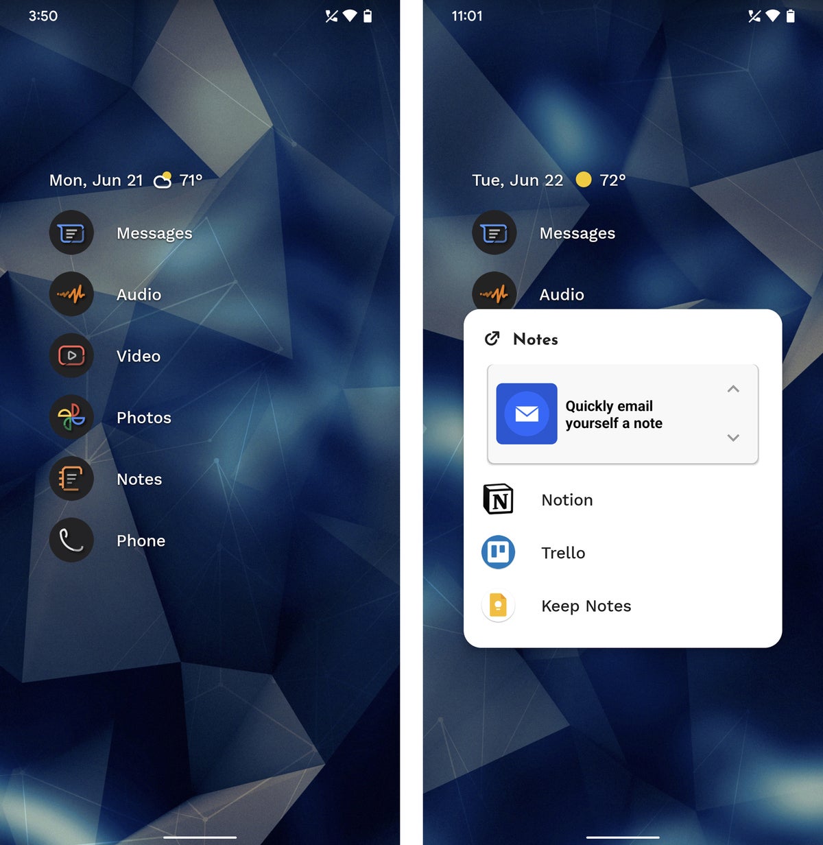
The Niagara home screen revolves around a single vertical menu of your most-used apps, but there’s much more to it than initially meets the eye. First, any shortcut on the home screen can either act as a traditional one-tap shortcut to opening an app or serve as a way to pop up a supercharged folder with a combination of both apps and widgets inside it.
 JR Raphael/IDG
From the simple vertical app menu (at left) to the supercharged folders (at right), Niagara’s home screen is all about simplicity and easy access to the items you need.
The top of the home screen, meanwhile, features a classy built-in info widget that can show you the current weather along with upcoming event info and even your phone’s current battery level. Tapping it pulls up a pop-up agenda panel with an even broader view of your agenda.
When you want to find an app that isn’t on your home screen, you simply slide your finger up or down along the edge of your screen to move through Niagara’s scrolling app list and jump to whatever it is you need. In a nice ergonomic twist, you can swipe or tap the list from the left or the right side of your screen, even, making it convenient to access no matter how you hold your phone.
Niagara has lots of other thoughtful efficiency-oriented features, including an option to show active notifications alongside an app’s icon on your home screen — even going as far as to let you interact with notifications and respond to messages or dismiss pending alerts right from that same area — along with a smart search system that’s easily accessible with a single swipe upward anywhere on your home screen.
Niagara Launcher is free with an optional $6-a-year or $15 lifetime Pro upgrade that unlocks some of its more advanced options, including the built-in calendar and weather widgets.
In short: If you’re willing to keep an open mind and allow yourself a few days to adapt to a new and very unconventional approach, you might just find Niagara’s clever method of organization to be exactly the efficiency-enhancing change you didn’t know you needed.
If you like the idea of effortless organization but prefer a more traditional grid-based home screen arrangement, Smart Launcher 5 is an interesting option to consider. Smart Launcher works to organize and optimize your home screen setup for you — continually — without any real thought or effort required on your part. But it does so within a more familiar-looking Android home screen environment.
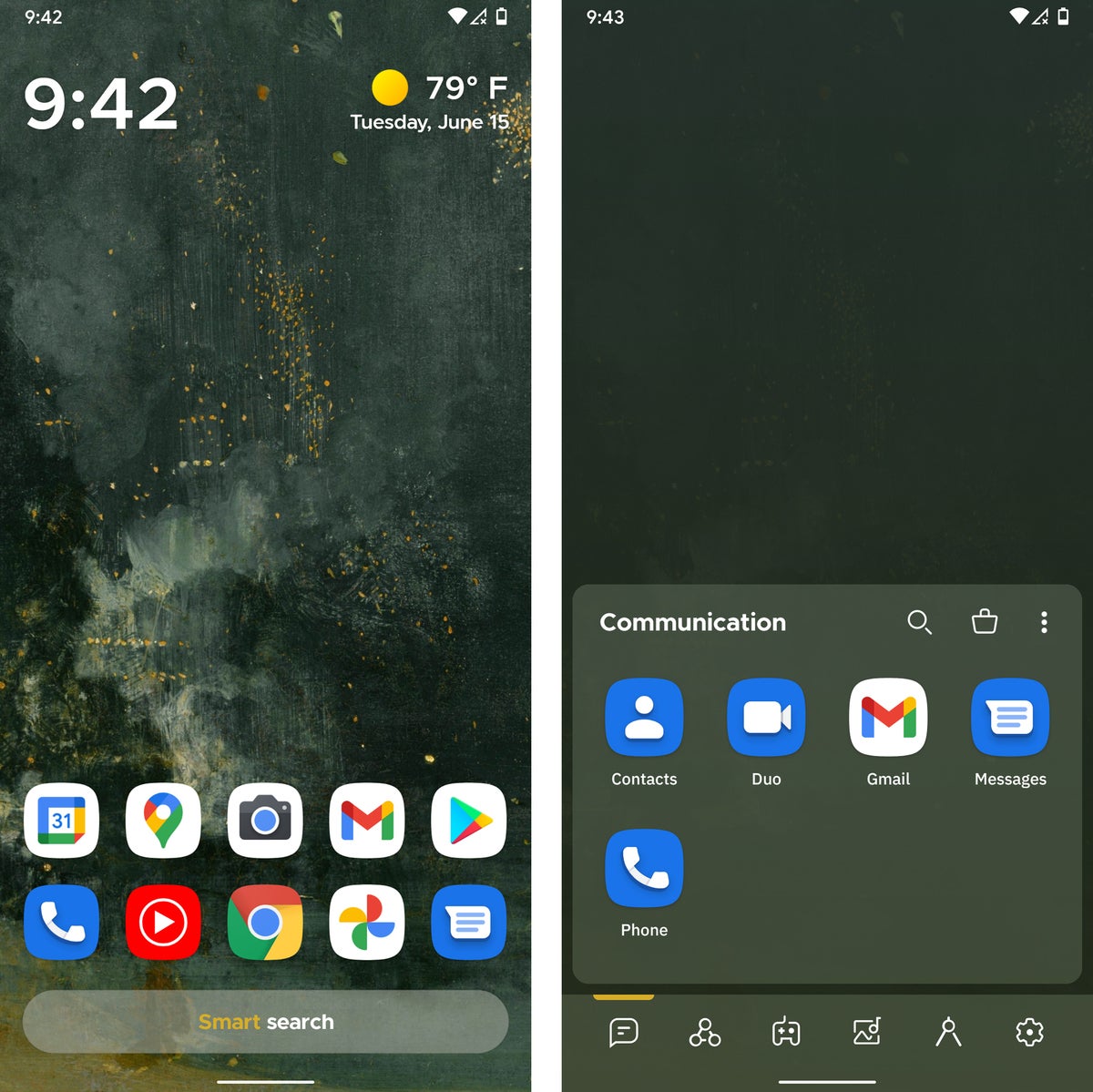
Looks aside, this setup most certainly isn’t conventional. Rather than giving you a completely open canvas for whatever placement of shortcuts and widgets you want, for instance, Smart Launcher keeps your icons neatly arranged into locked-down rows on its main screen. Swiping up on that area reveals a dynamically categorized app drawer of sorts, which separates all of your apps into automatically sorted categories like “Internet,” “Communication,” and “Media.”
 JR Raphael/IDG
Smart Launcher features a self-organizing home screen (at left) and a category-based system for browsing all of your apps (at right).
Beyond that, Smart Launcher provides a totally separate panel specifically for widgets, to the right of the main home screen area, and another panel with a built-in news feed (powered by Microsoft News) to the left. Just like with our first two apps, the launcher’s search system lets you quickly find apps, contacts, or information from the internet in a single streamlined spot. Smart Launcher’s search tool can even surface info from inside of apps — pulling up results for pizza places near you from Grubhub or Yelp, for instance, if you search for “pizza nearby.”
Smart Launcher 5 is free with an optional $2.50-a-year, $7-a-month, or $17 lifetime Pro upgrade for a variety of advanced features.
In short: If you want a neatly organized home screen that does all the organization for you, Smart Launcher 5 is up to the task.
Android is typically a Google-centric affair, but little by little, Microsoft has been creating its own sub-ecosystem right within the platform’s walls — and the centerpiece to that setup is the aptly named Microsoft Launcher.
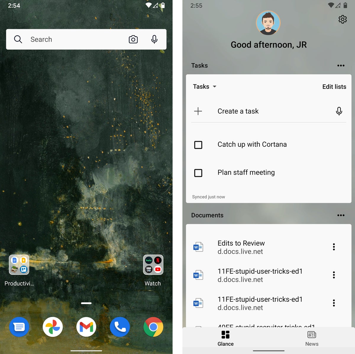
Having Microsoft Launcher on your phone really does make it feel like you’re using a Microsoft Android device instead of a Google Android product. Most prominently, the app’s feed-like panel gives you glanceable info from your Outlook calendar along with tasks from your inbox and a list of recently accessed documents from your cloud-based Microsoft Office storage. It also offers a Microsoft-powered news experience and a Bing-powered search system.
 JR Raphael/IDG
Microsoft Launcher puts Bing front and center and adds plenty of other Microsoft-centric touches to your home screen environment.
Microsoft-specific elements aside, the Microsoft Launcher is also just a nicely crafted take on the Android home screen interface, with a pleasant mix of tidy-looking simplicity and more advanced organizational options.
The app is completely free to use.
In short: If you work in Windows and want your phone to feel like an extension of that same ecosystem, Microsoft Launcher is the way to make it happen.
Square Home: Windows Phone meets Android
For all of its Microsoft focus, the actual Microsoft Launcher has nothing to do with the company’s now-abandoned Windows Phone effort and the content-packed organizational system that platform established. For that, you’ll want to turn to Square Home, which picks up where Windows Phone left off and brings its distinctive tile-centric setup into the realm of Android.
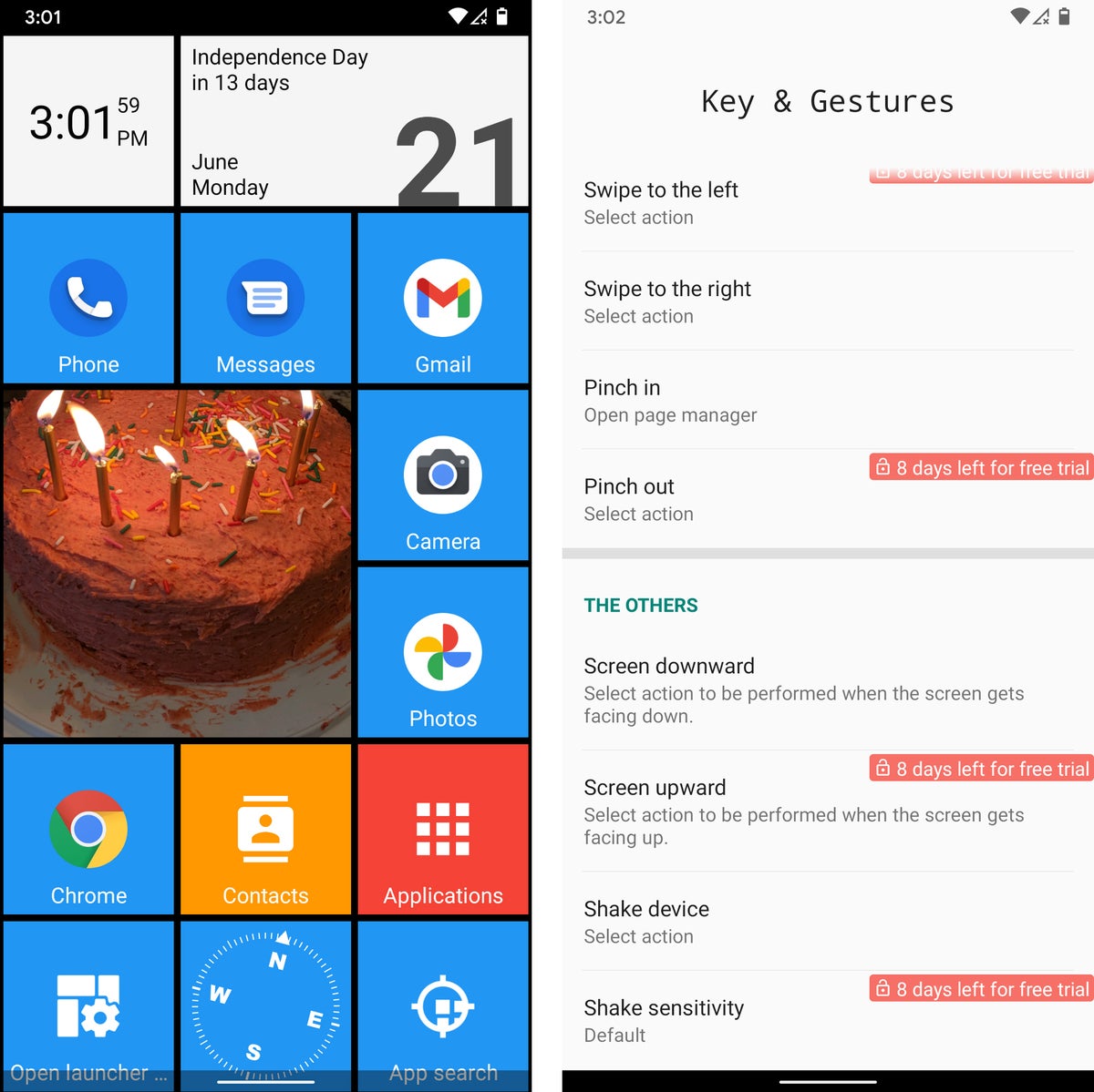
Even if you didn’t use Windows Phone, you might find Square Home to be a refreshing change that enhances your workflow. The launcher puts a series of customizable tiles on your home screen, each representing an app shortcut, a widget, or some other sort of action. You can even treat a tile as a three-dimensional cube and store related shortcuts on each side — say, Google Drive on the front, then Docs, Sheets, and other productivity apps on the inner sides — and then swipe the cube in any direction to access the associated items.
Square Home has tons of options, including some that let you control exactly how your tiles appear — everything from the number of columns for the tiles to the size of icons and text within them and the color and style of backgrounds used for different blocks. It also allows you to create some potentially useful custom shortcuts beyond just the usual gestures. You can set certain actions to occur when your phone is set flat with its screen facing either up or down, for instance, or even when you shake your phone.
 JR Raphael/IDG
Square Home transforms your home screen into a Windows-Phone-like environment, with plenty of advanced shortcuts and time-saving options.
Square Home is free with an optional $5 key for advanced features, options, and tile effects.
In short: If you miss the old Windows Phone interface or just like the idea of keeping everything you need in front of you and neatly organized in a geometrical manner, Square Home is your Android home screen answer.
Feel like you’re spending too much time on your phone? Before Launcher is all about giving you a minimalist, no-frills home screen for distraction-free productivity — a setup its creators claim can help you open your phone a whopping 40% less than you do now.
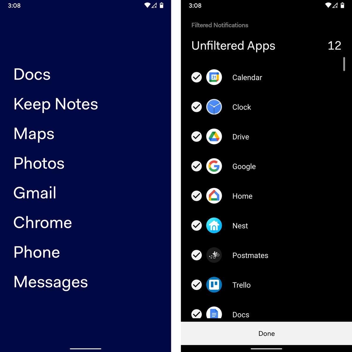
Before’s primary home screen panel is a plain-as-can-be text-based list of your most frequently accessed apps, with not a single icon or eye-catching flourish to be found. If you need to get to something else, you can find a complete list of installed programs one panel over to the right. And to the left sits a filtered notification drawer that can hide low-priority notifications and make ’em available only when you actively opt to seek ’em out.
 JR Raphael/IDG
From the plain-text primary home screen to the built-in notification filtering system, less really is more with the understated Before Launcher.
Before has some simple options for customizing the appearance of your home screen, but it’s all pretty barebones and basic by design. The launcher also offers an optional $6 Pro upgrade that adds in a handful of more advanced features, including a custom folder and label system for apps and the ability to hide apps entirely out of view.
In short: If you want the utmost in simplicity and a setup that keeps distractions almost entirely out of sight, Before Launcher is just what the minimalist ordered.
From minimalism to maximalism, the last launcher in our list is a longtime Android power-user favorite that provides you with every option under the sun. Nova Launcher starts you off with a simple blank slate and lets you set things up in any way you want, down to the tiniest of details.
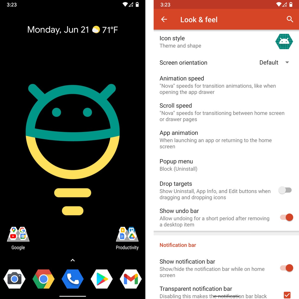
It’s no exaggeration: Once you add whatever series of shortcuts, folders, and widgets you like to your home screen panels, you can peruse Nova’s settings to find intricate customizations for almost anything imaginable — ranging from the precise size of the font used for app names to the amount of padding between items, the level of transparency of the app drawer background, and even the style and speed of every animation and transition you see.
Beyond just the customization stuff, Nova has some seriously powerful possibilities for optimizing your home screen to any set of specifications. You can create a custom dark theme that makes various areas of your home screen easier on the eyes as soon as the sun goes down, you can create a variety of custom gestures for quickly accessing any apps or actions you need, and you can add in helpful shortcuts like one-tap commands for tasks like uninstalling or restarting apps on demand.
 JR Raphael/IDG
Nova Launcher’s extensive series of options gives you an extraordinary amount of freedom to make your home screen look and work exactly how you want.
Nova Launcher is free with an optional $5 upgrade for certain advanced features.
In short: If you want complete control over every element of your home screen environment — and you know exactly what kind of effect you’re after — Nova Launcher’s got your name written all over it.
This article was originally published in June 2019 and updated in June 2021.
Copyright © 2021 IDG Communications, Inc.
