For those unfamiliar with Apple’s lingo, this year the Cupertino company’s Pro models ditched the iconic notch in favor of a new cutout. In truth, however, the iPhone 14 Pro has not one, but two cutouts: one for the selfie camera and another for the Face ID sensors.
The Dynamic Island surfaces (pun intended) when iOS merges the two cutouts and creates a feature that represents a “seamless blend between hardware and software” in Apple’s own terms.
Admittedly, the aforementioned statement is, strictly speaking, accurate – the blend is indeed seamless. The problem is that both the software and the hardware behind the Dynamic Island are suboptimal for a number of reasons.
In the following paragraphs, I will give my take on why the Dynamic Island, in its current state, is more of a gimmick that seeks to mask lazy design than a truly useful feature. Now would be the time for two disclaimers.
Firstly, this is just one man’s opinion, based on personal experience owning an iPhone 14 Pro. Secondly, this is in no way an Apple rant – I actually consider myself an Apple fanboy and I am very much deep into the Apple ecosystem.
Now, after the rather lengthy intro, I will present my case as to why the Dynamic Island represents a (notably rare) instance of poor execution on Apple’s part.
The Dynamic Island’s imperfect hardware
Islands versus peninsulas
On the hardware front, I want to address a very obvious pet peeve many have with the Dynamic Island. The whole point of introducing a cutout is to maximize the amount of usable screen real estate and to achieve an optimal body-to-screen ratio. In a sense, almost every smartphone manufacturer is working towards reaching the Holy Grail: a full edge-to-edge screen.
It should be noted that Apple has, in fact, increased the screen-to-body ratio of the iPhone Pro lineup with the implementation of the Dynamic Island. But has this maximized the amount of usable screen space?
The answer is a clear “no”. The Dynamic island may be narrower than the notch on the previous generation, but the pixels above the former are virtually unusable. This means that the Dynamic Island effectively takes more vertical space than its predecessor.
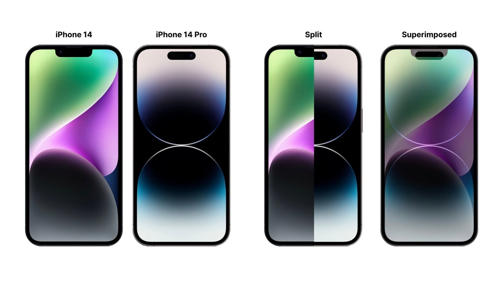
Based on the image above, we can clearly see that the Dynamic Island makes rather poor use of screen space and is, in some regards, worse than the notch. This has become apparent to me while using third-party apps. Content that would otherwise be visible with a “notched” iPhone is pushed further down. Nevertheless, this issue will likely be resolved shortly as developers increasingly optimize their apps for the new iPhones.
Progress to obsolesce
In fact, I dare say that if Apple had simply slapped the Dynamic Island on the top bezel, the iPhone 14 Pro would have had a more usable screen. However, then Apple would have been criticized for recycling the same design that it adopted some 5 years ago with the iPhone X. A big reason why Apple transitioned to the Dynamic Island is the need for a tangible design change. Well, the Dynamic Island is different, that much is true, but not necessarily in a good way. Furthermore, as Apple is already working on under-display Face ID, it would have made more sense to wait for the technology to evolve before changing the front design of the iPhone.
Many other Apple products have only recently adopted the “notch” (the MacBook Air did so this year), so sticking with something that has become iconic and is more usable, would have been, in my view, better than resorting to an interim solution only for the sake of delivering a design change.
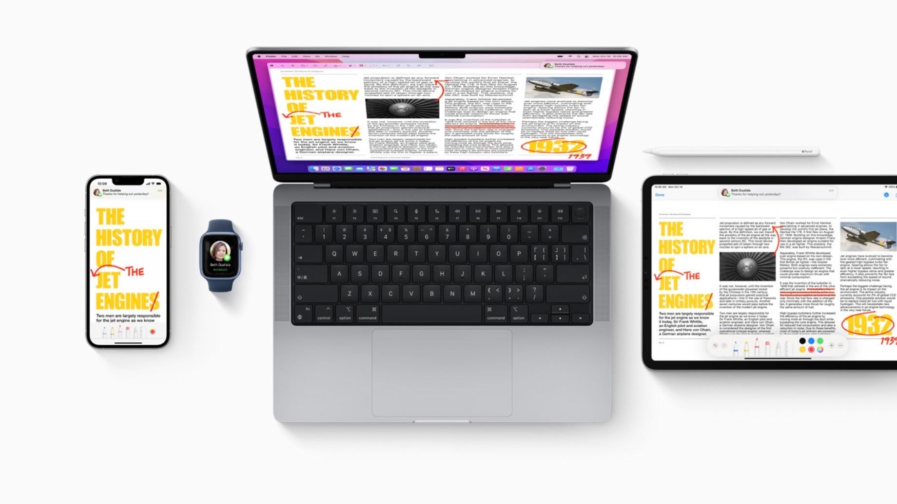
By this I mean that nobody expects Apple to keep the Dynamic Island around once it has figured out a way to put Face ID under the display. Thus, the Dynamic Island has built-in obsolescence by design.
The last part also ties in nicely with the second element of my critique. If the Dynamic Island is not made to last, there really is no point in making it particularly useful. In fact, by keeping its functionality limited, its removal will be received rather positively. Therefore, Apple truly has no incentive to step up its software game – hence, my next point.
The Dynamic Island’s limited software
What is the Dynamic Island supposed to do?
The biggest reason why I have an issue with the Dynamic Island being dubbed Apple’s latest “feature” is rather simple – it does not bring anything new to the table, it simply gives a new look to existing features.
Apple has explained that they want the Dynamic Island to display “Live Activities”. A developer blog post published by the company stipulates that the Dynamic Island should be used for tracking “tasks and live events that have a defined beginning and end”, by presenting “only the most essential content”.
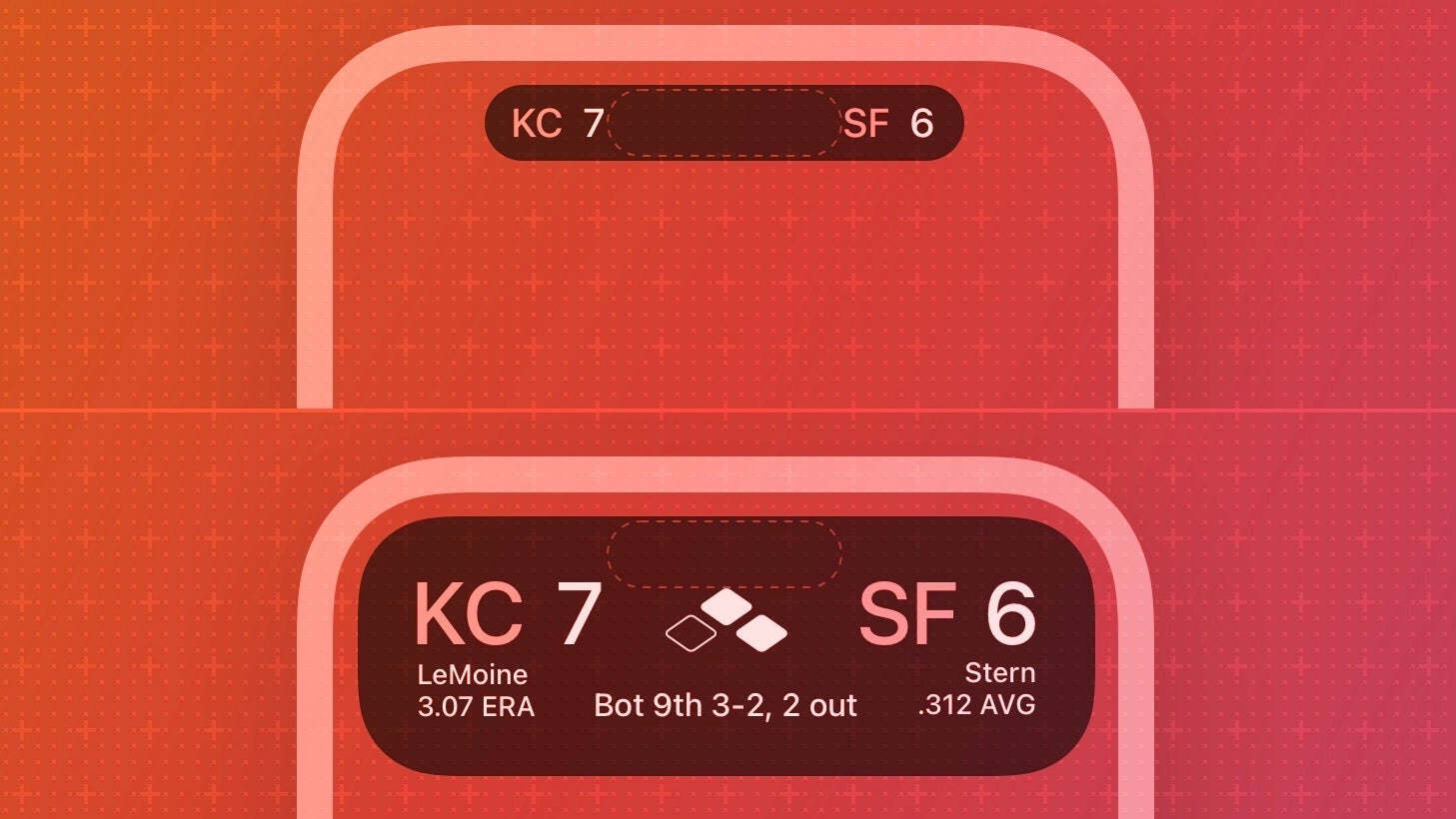
The Live Activity displayed by the Dynamic Island should update “only when new content is available, alerting people only if it’s essential to get their attention” and should “give people control over beginning and ending” it.
This all sounds good on paper, but there is just one problem. This can all be done via persistent banners. There is absolutely no reason to have the Dynamic Island constantly plaguing your UI, solely for the purpose of having a way to display Live Activities.
The Live Activities functionality is there to justify the existence of the Dynamic Island and not vice versa. This makes them both more of an excuse than actual features – in theory, at least.
Using the Dynamic Island in practice
But theory does not mix well with practice, so I wanted to see for myself whether the Dynamic Island makes sense in day-to-day usage. Admittedly, there are a couple of use cases I enjoy.
Tracking timers set via the Clock app is really nice, and having the option to interact with Apple Music without having to open the app is even better. I loved being able to change the song while reading the news, without having to pull down the Control Center.
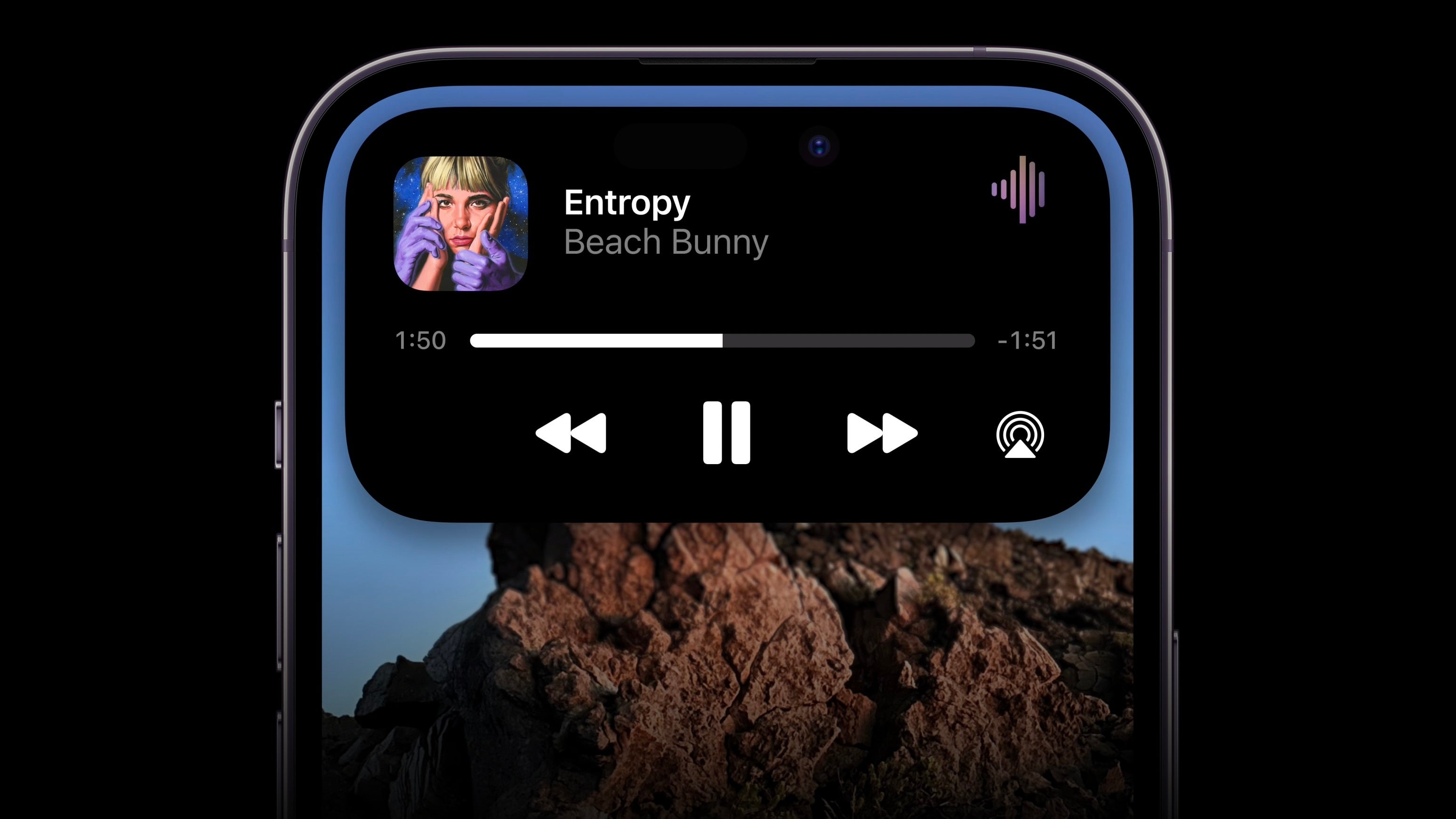
However, that is about it. Does it make all that much of a difference? Truth be told, I don’t really need to know how much time is left until the alarm rings – I only need to hear it has lapsed.
Additionally, most of the time I will be listening to music with my iPhone locked anyway (funnily enough, the Dynamic Island is on the top of the display, but the lock screen player is on the bottom of the screen instead).
Now, I might be an exception, but many reviewers have also noted that the Dynamic Island does not have a plethora of useful purposes, Mark Gurman sums it up nicely in his Power On newsletter – “there are only four compelling reasons to use it … phone calls, music playback, map directions and the timer”.
Final Verdict
The Dynamic Island might have some true potential, especially if third-party developers find a way to make creative use out of it. However, it is, above all, a clever way for Apple to conceal the ugly truth: that the iPhone 14 Pro has two big, unappealing cutouts on the front.
It is a seamless blend between imperfect hardware and limited software that introduces a feature that could have been achieved with a simple iOS update.
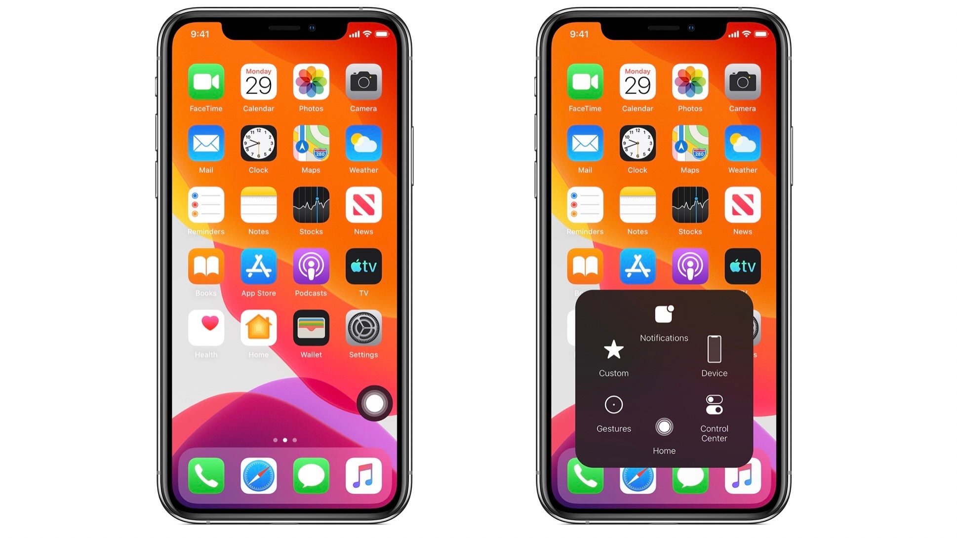
In a way, it reminds me of when Apple first introduced AssistiveTouch. Because the Home Button had become integral to the iPhone, the option to implement it virtually was added so as to ensure that users would always have access to it. Funnily enough, the physical Home Button is long gone, but many iPhone users still use AssistiveTouch to this day. I sincerely doubt that when (not if) Apple removes the Dynamic Island, a similar situation will arise.
At any rate, I am still in love with my iPhone 14 Pro. I genuinely think it is one of the best smartphones of 2022, and I look forward to using it every day. But the reason for this is most definitely not the Dynamic Island.

