Read my review of Amazon’s latest Fire TV Cube, and you’ll find within it a tale of tragedy.
The third-generation Cube is a powerful streaming box full of neat tricks. You can control it hands-free with Alexa, plug in a wide range of USB accessories, and even feed video from a cable or satellite box through its HDMI passthrough ports. The remote control is a step up as well, with a helpful “Recent” button for flipping between apps.
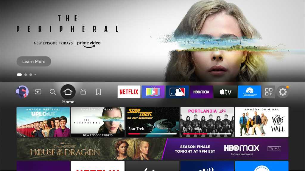
Yet all these technological achievements are undermined the Fire TV interface, which remains a confusing, chaotic, ad-ridden, self-promotional mess. As other streaming platforms make great strides in usability, Amazon is falling further behind.
So in the interest of constructive criticism, here are a few entirely unsolicited ways that Amazon can and should do better:
Slay the first banner ad
Jared Newman / Foundry
Banner ads have been a longstanding annoyance on the Fire TV home screen, but they became even worse after a major redesign last year. Now, the first ad appears ahead of the “Recently Used Apps” section, causing those apps to slide out of view when you’re on the first home screen row.
While I recognize that advertisements help subsidize Amazon’s cheap streaming hardware, letting them obscure essential parts of the interface is going too far. Amazon should remove that first ad, demote it further down the home screen, or come up with a new system for ads that doesn’t hinder navigation.
Expand the “Recently Watched” row
Jared Newman / Foundry
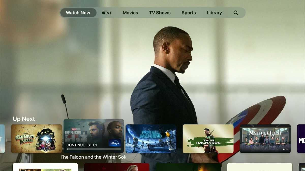
Both Apple TV and Google TV (and soon Roku) have rows on their home screens for picking up where you left off. When you watch a show in a supported app, it’ll appear in that row, so you can click through and start watching without remembering which show came from where.
The Fire TV’s own “Recently Watched” row is practically worthless by comparison, because it only works with shows from Prime Video. Amazon needs to get over itself and open that section to other apps, such as Netflix, HBO Max, and Hulu.
Give users more control over what shows up
Jared Newman / Foundry
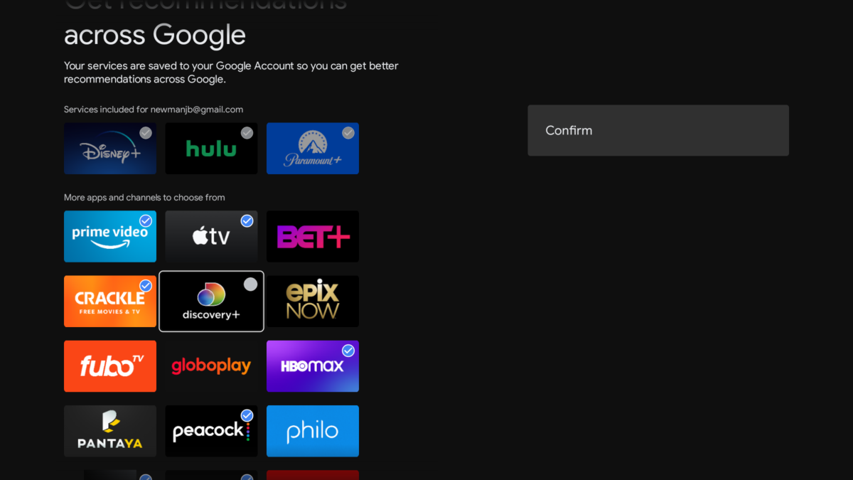
I often refer to the Fire TV’s interface as “chaotic” because you have no say over what appears on it. Suggestions from apps such as Netflix and Tubi appear in no particular order, and with no ability to signal that you’re uninterested in a particular app or service.
Google TV is leading the way here by letting you choose which streaming services can suggest content on the home screen. You can even improve the recommendations by voting on the kinds of shows you like. A little more control would go a long way toward making the Fire TV experience better.
Rethink the six pinned apps
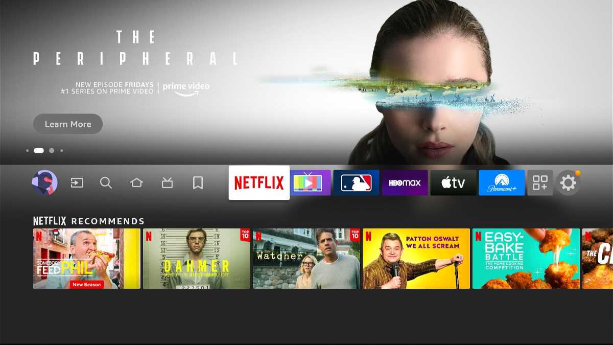
Amazon’s glanceable home screen tiles are a quick-and-dirty fix for bigger problems.
Jared Newman / Foundry
Related to the observation above, the Fire TV interface does let you pin six favorite apps to the top of the home screen for quick access. Some apps even take this a step further, showing recommendations when you highlight them.
But the more I think about it, the more this seems like a band-aid measure to cover up the Fire TV’s greater failings. A section of pinned apps is only necessary because of the banner ad hiding your recent apps, the lack of third-party content in the “Recently Watched” row, and the inability to customize other parts of the home screen. The whole setup just needs to be reconsidered from scratch.
No more mystery icons
Back in June, Amazon replaced the “Home,” “Find,” and “Live” buttons at the top of its home screen with icons, whose purpose only appears when you highlight them. Web designers refer to this as mystery meat navigation, and while it allows Amazon to cram more items into the top bar, it also makes the interface more confusing. Along with the pinned app issue above, it’s another sign that the entire top row needs a rethink.
Show your sources
Jared Newman / Foundry
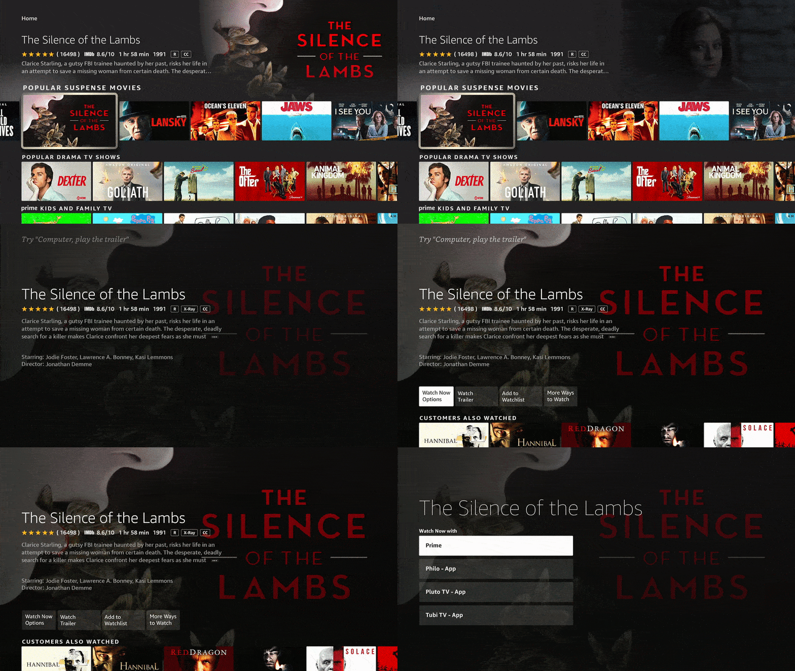
At a system level, Amazon has no way of showing the source of a movie or show that you’ve highlighted on the home screen. The only way to see where it comes from is to click through to its individual listing page, and even then, you sometimes have to click a “More Ways to Watch” button to see a full list of available streaming sources.
Amazon should look to the TiVo Stream 4K for inspiration, adding a simple set of icons to its home screen descriptions to signify the source of a movie or show.
Less monotonous visuals
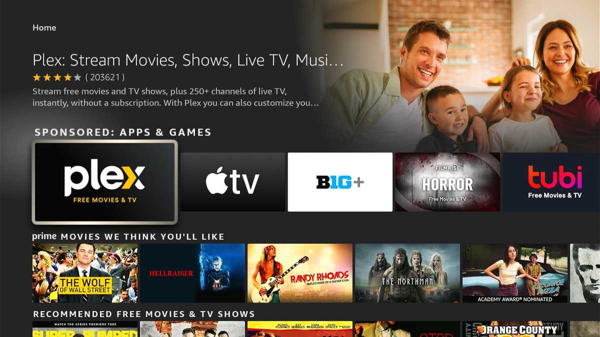
The Fire TV’s sea of equally-sized icons isn’t much fun to look at.
Jared Newman / Foundry
Another reason the Fire TV home screen feels overwhelming is that every row has an identical layout of tiles. Most streaming services have realized that it’s better to shake things up with taller tiles, larger posters, and circular spotlights. Even Amazon’s own Prime Video app got an update earlier this year with more interesting visuals. The rest of the Fire TV interface should follow suit.
While I’m hardly a master businessman, one thing I’ve learned running a modest newsletter business is that too much aggressive self-promotion just drives people away. It’s a lesson seemingly lost on Amazon, which by my count dedicates nearly a third of its home screen to Prime Video and Freevee content. Combine that with the home screen’s excessive advertising, and there’s not much room left for useful content.
Maybe Amazon has telemetry that proves otherwise, but I’d guess that this relentless self-promotion makes people less likely to peruse the home screen in the first place, and more likely to shelter inside individual apps. Amazon needs to think up a better system that works both for users and its bottom line.
Sign up for my Cord Cutter Weekly newsletter to get more streaming TV insights every Friday.

