Samsung plays it safe with colors: and that’s been the case for awhile
Yes, the Galaxy S24 colors this year are, in theory, not the same as those of the S23 last year. The hues are indeed, different, but they basically stay within the same lane, don’t they?
We still have a subdued violet/purple, we still have a subdued yellow/white (the Cream for the S23), and the usual suspects of black and gray, etc. We don’t have to look at the entirety of the Galaxy S24 colors to know that the similarities don’t end there. As exclusive colors, we’re getting light blue, light green, and light orange this year.
The S24 Ultra this year sports different colors to underline the new Titanium design. But yet, the shades are similar: violet, yellow, black, and gray. For the Ultra, we get Titanium Orange which gets a bit closer to being a daring color, but still, it’s very under-saturated as well.
The Galaxy S23 Ultra in red
When talking about colors, we can’t escape the fact that those are not randomly picked. Let’s briefly discuss… a principle in fashion, shall we?
Trends and brands: one does it first, the others copy; or why isn’t Samsung stepping up?
One might argue that Samsung is sticking with the trends when it comes to the Galaxy S24 colors. It’s a thing that those colors look premium, they do look stylish and all. But if you know a thing or two about fashion, you’d know that big brands usually set the tone of what’s trendy and what’s not. Yep, I’m referencing fashion here, and despite Samsung not being Gucci, it’s the same principle. The company is one of the biggest on the tech market, it has a stellar reputation for design and it’s in the best position to offer something new in terms of colors. If a lesser-known Chinese company does it, we may not pay as much attention, but if Samsung does it… then the rest is history, isn’t it?

Food for thought – why not a Galaxy Ultra color that’s bright and powerful like the sun in this picture? A red palette that’s quite daring for a phone, I might add (Image Source – Pixabay)
Then what about a new approach – two colors that look good together (something like Bespoke Edition, but as a main color option)? Why not take things up a notch and come up with a real galaxy-inspired color option?

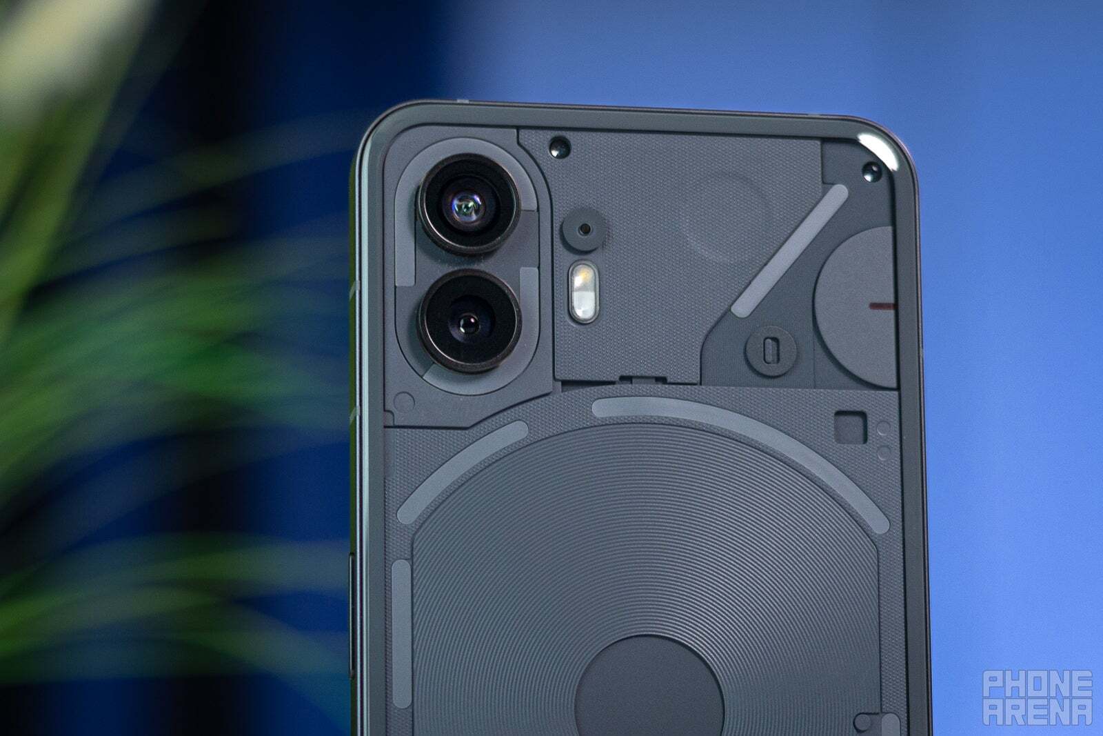
The Nothing Phone 2. Whether or not you like that design, you can’t argue that it’s not unique
Of course, maybe me recommending these options may sound cheesy, but think about it. Samsung’s design, overall, is impressive. The way these phones look, quite frankly, no matter what color you put on them, they’ll still look premium, don’t you think? I’m not saying Samsung should go for a cheap-looking sparkly phone or copy Nothing. But it should at least think about setting a new trend in color. Here’s to hoping the company will look into that for the future, and sprinkle some innovation in this department as well.

