, and left it entirely to the mercy of companies like Xiaomi, which is rumored to release a version of its own
handset as many other makers before it have tried.
Touchscreen fatigue
Apple has rightfully caught the whiff of touchscreen fatigue that is sweeping through the user experience lately. Touchscreens and capacitive keys have become so ubiquitous that consumers are longing for something new, fresh, and tactile they can interact with.
The novelty of the touchscreen, introduced en masse with the OG iPhone, is quickly wearing off as people realize that companies are resorting to touch displays and capacitive buttons on everything from cooking stoves to cars just to save money.
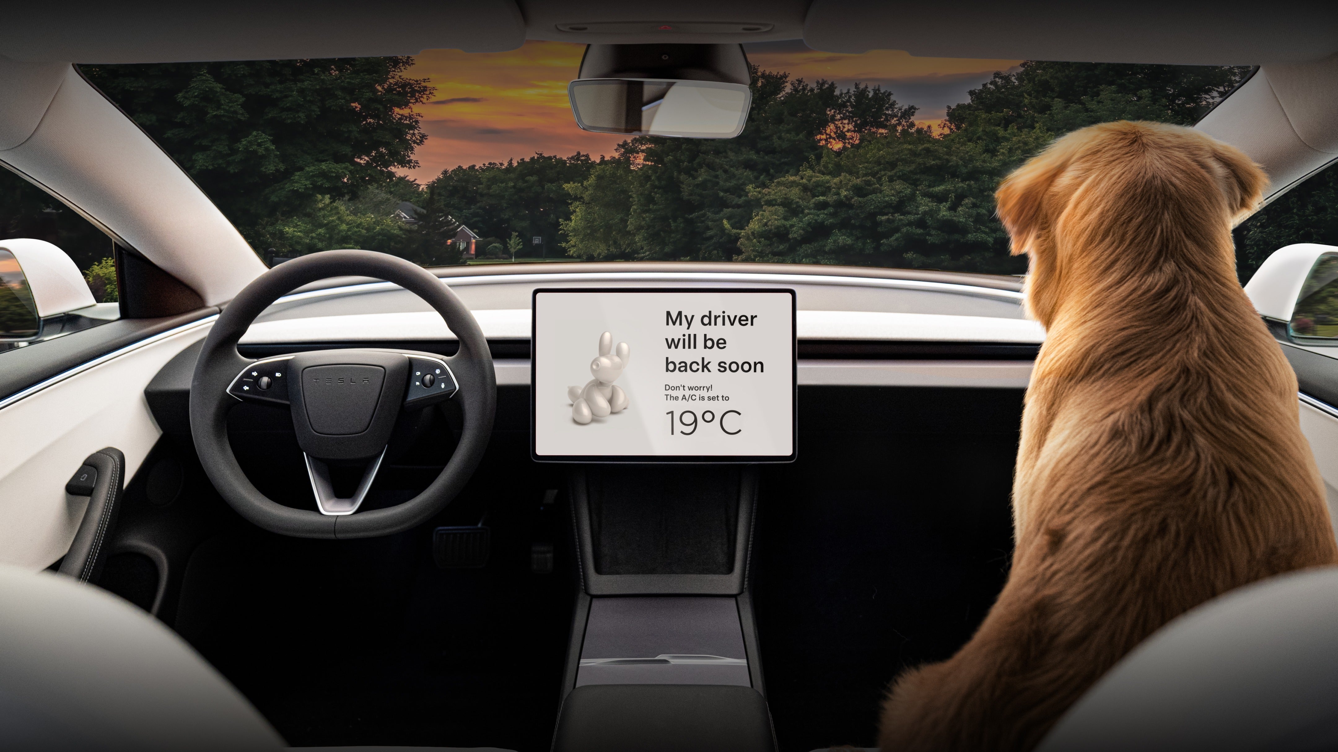
Ergonomics be damned, as anybody who has had to guess how a cooking top in a rented Airbnb apartment works can attest to, or even tried to adjust the A/C on a modern Tesla car equipped solely with a touchscreen. Even turn signals have become are a problem now.
Those newer Teslas are being sold as having a modern minimalistic interior, but in essence have just one big touchscreen to control it all, as that is the cheapest way possible. Starting in 2026 the Euro NCAP safety body will start assigning lower safety ratings to stalkless vehicles without the necessary set of tactile buttons and turn signals precisely on account of the capacitive touch phenomenon that is very visible in the latest Model 3.

No stalks, no selectors, no physical buttons, just capacitive touch and Dog Mode. | Image credit – Tesla
Design schools and company departments are now increasingly drifting away from the display trend that swept the industry in the last decade or so. There is an ever-growing number of cooking tops, home stereo sets, and even cars with things to push, click, or rotate physically with one’s finger.
Button-less phones
Touchscreens still make sense on phones and smartwatches, though, which only leave their sides to experiment with when it comes to the trend for returning the good ol’ physical controls like buttons, knobs, and crowns. Apple has reportedly been mulling a button-less handset for a while, but gave up on the idea for some reason.

The iPhone has too many buttons
It is undoubtedly less than ergonomic to make a completely buttonless phone, but there is also something to be said for a phone with too many buttons, and that is what the iPhone 16 has become.
Between the volume and power buttons on the left, plus the new Camera Control and Action Button on the right, there are no less than five physical controls around the sides of each member of the iPhone 16 series.
The redundancy of the iPhone 16 Camera Control key
Apple has calculated the capacitive key zoom pressure to be neither too light, to avoid accidental slides, nor too heavy to require too much pressure, hence interfere with the smoothness of the zoom motion. That does take some getting used to, though, since one has to exert a predetermined amount of pressure for anything to happen.

Another gripe is the sheer usefulness of the Camera Control key. Besides having the design ready from its efforts around the buttonless iPhone, Apple reportedly added it in order to force users to record landscape footage, as plenty of advertisers were complaining that video shorts from the iPhone are mostly coming in portrait mode and there is not enough space to fit ads there.
That the iPhone 16‘s fifth button is aimed at video shorts seems a plausible scenario, as it records footage only by pressing and holding the button while filming, which precludes any long-form videos from happening.
Apple is playing yo-yo with the iPhone buttons
One may argue that this is the typical Apple approach of gradual introduction that eases users into new designs or technology, but for the regular iPhone user, this could feel like Apple is playing yo-yo with the buttons and ergonomics on their beloved phone for no particular reason.

