Android 12 may have nearly just been released, but that doesn’t stop Google from already going hard at work on next year’s update to the OS, Android 13, a.k.a. “Tiramisu.”
Android 13: Panlingual
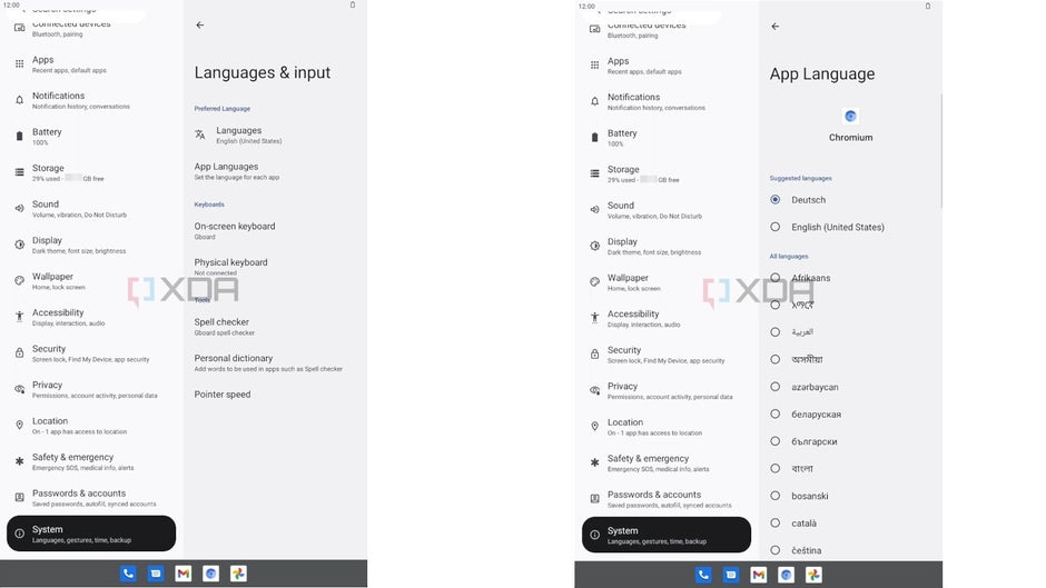
For starters, we definitely get a better look at the “Panlingual” feature, which is more or less confirmed now that we see it as part of the new Android Settings, rather than just hearsay.

As you can see in the images above, under “Languages and Input” in the Settings app, a new bar titled “App Languages” is now visible, which bears the description “Set the language for each app.” Once you go in, you have the ability to tap on any of your apps in a list created for you, and set its individual language.
Hopefully, this should make the Android phone experience much more convenient and efficient for bilinguals or multilinguals—or even those who are learning a new language, and want to be immersed in it in certain applications but not others. They will no longer have to go into each individual app to set their language preferences, but will be able to do so through the unifying feature in Settings that is Panlingual.
Android 13: Notifications Permissions
While Android will not be able to force apps running on Android 12 or previously to display the notifications permission request, all apps newly installed on Android 13 will likely have to comply.
Currently, Android users often suffer from something of a notifications overload. Most of us have at least a few dozen apps on our phones that we use, and each of those apps is usually automatically authorized to send notification banners on the home screen, and it often just gets to be too much
Android 13: new lock screen clock layout
Next year, it also seems Android users will have more control over their lock screen clock face position, particularly when notifications stack up.
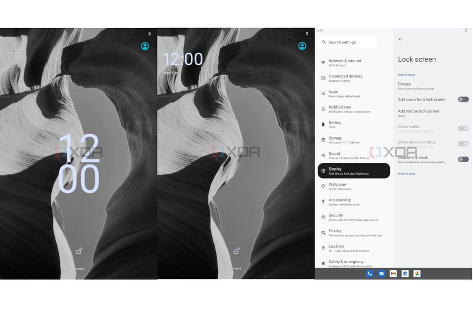
At the moment, the clock face is situated smack dab across the lock screen when it’s empty, but once the notifications start piling up, it shifts to the top left to make room for them (shown below).

Many users haven’t been too fond of this feature, and have repeatedly requested that Google give them more freedom to control the clock face appearance.
Now, a new “Double-line clock” on/off toggle is being added to the Android 13 lock screen settings.
By turning it off, users will have the option to have the clock face remain the same, in the middle of the screen, with the notifications stacking up below it—rather than shifting to the corner and have the notifications splay across the entire screen.
Android 13: TARE
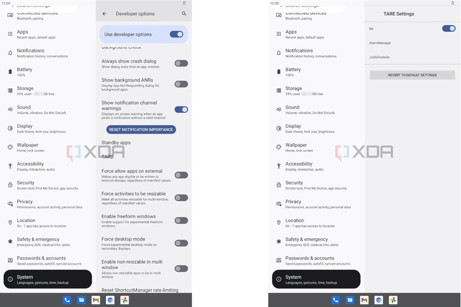
This is perhaps one of the most out-there additions to Android 13 so far. Focused towards developers rather than regular users, TARE’s “Android resource credits” are set to be a sort of battery economy currency that is awarded by Google to apps, depending on how much they deplete the phone battery per hour of use. The more TARE credits an application obtains, the more tasks it is allowed to perform in the background of the device.
As seen in XDA‘s exclusive Android 13 screenshots, a “TARE Settings” category is already present in the Settings with “Developer Options” enabled.

This is all the the insider info on Android 13 that we’ve gotten our hands on so far, but there are bound to be many more feature leaks coming our way in the next weeks and months, so stay tuned!

