In the competitive market of hypercasual games, it’s crucial to constantly analyse the top projects in the app stores to gain an understanding of how their game design, mechanics and monetisation work. By taking a deeper dive into some of these successful games developers can learn the do’s and don’ts for their own projects.
Azur Games and Google Ads got together to discuss the hypercasual model and the development of monetisation. As part of this discussion, publishing lead at Azur Games Sergey Martinkevich, looked at the popular idle arcade game, My Mini Mart.
_____________________________________________________________________________
Let’s discuss the product and break down a trendy game into components because I see developers all around the world repeatedly making the same mistakes in content delivery, initial gameplay flow, and progression. I think this is because not many people carefully study the composition of successful games, which is the only way to understand how everything should work.
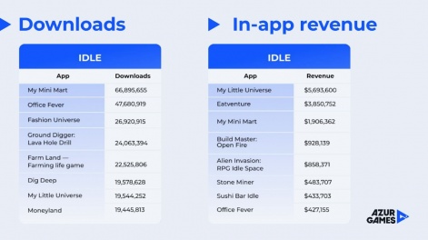
Let’s analyse My Mini Mart, which is the biggest idle arcade game of 2022 in terms of installs.

My Little Universe may have earned more money (and is incredibly well-made as well), but My Mini Mart has some interesting game design solutions that are worth exploring.

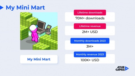
My Mini Mart was released in late 2021 but it gained popularity in 2022. Currently, the game has over 70 million downloads, and its lifetime revenue exceeds $2 million, which is impressive for a hypercasual game. Even in 2023, the game continues to achieve around 3 million monthly downloads, with in-app revenue of over $100,000, which is significant for a hypercasual game.
The tutorial in My Mini Mart is straightforward, and even if you haven’t played the game before, you’ll understand everything. The first points of interest are highlighted with arrows, and the controls are pretty standard. My Mini Mart is a game about managing a chain of resources, so you need to engage the user in a way that immerses them in this cycle. My Mini Mart has a perfect flow in this regard.

At the start of the game, the player buys a cash box where they receive soft currency. Then, they open a shelf for tomatoes and only after that, the actual source of the resource — the tomato bed — is unlocked. This may seem illogical, but it is a fantastic solution that will be explained later. Typically, I see the opposite in prototypes, developers create a resource spot first, for the player to collect resources before opening the deployment spot.
In the first cycle, it is important that the player does not spend more than two seconds moving around. A common mistake in games is forcing the player to run for more than five seconds to reach faraway points of interest, turning the game into a running simulator instead of a resource management game.
Animations are also crucial in the game, such as how tomatoes are collected from the bed, placed in boxes, and how the boxes are packed. Watching the animation is enjoyable, making even the most mundane tasks less boring. Many games lack animations when collecting resources or soft currency, leaving the player confused about what is happening, which is a big mistake. However, in My Mini Mart, everything is smooth.
Initial conclusions: use a lot of animations and short distances within the first cycle.
Design decisions
Once we complete the first cycle, we will need to repeat it 2-3 times to accumulate sufficient funds to unlock a second tomato bed. Notably, when a new point of interest becomes available for purchase using soft currency, the camera dynamically pans toward it, directing the player’s attention to the new addition.
This feature is necessary for games with small locations like My Mini Mart because there is already a lot of “noise” on the screen. For games with larger locations like My Little Universe, where exploration is the main focus, there is no need for camera movement because the player will eventually find everything on their own. But if the location is small, show your players they can pay 10 more dollars to unlock something new.
After the tomato bed, a new resource spot appears, a shelf with chicken eggs.

The player still doesn’t have any chicken eggs, just like with the tomatoes in the beginning. It means that the developer is making them play the previous cycle again, without actually providing any new content. It’s a fantastic game design decision. Now the player needs to earn an additional $20 from tomatoes in order to unlock the chicken coop, and they understand why.
Once the user opens the chicken coop, the resource chain becomes even deeper. Now they can bring a tomato from the first cycle to the chicken (I don’t know if chickens actually eat tomatoes, but it’s not important because it’s amusing). The chicken will give them an egg, which they can then put on the customer stand.
This is what I mean by working on game design. In some places, the developer motivates users to keep playing without providing any new content, and it’s still not boring.
After each spot is opened, the game shows another new place. Every time, the user feels like they’re exploring. Even though it’s a very small location game, the sense of exploration is fantastic.
Then they can unlock a helper, a funny pink guy who assists with all the routine tasks. This is necessary to alleviate some of the user’s stress, as these ups and downs are important for retention. Now they can concentrate on managing their resources.

Gameplay cycle
Then, once again, they need to gather $25 to open another shelf. The game forces users to replay the previous two cycles, but they’re motivated because they just unlocked a new shelf they want to fill. Players know there’s something interesting ahead and they want to explore it. So, they gather another $25 and unlock the blender to make ketchup from tomatoes, which makes the resource chain even deeper.
Now I can take a tomato, put it on the tomato shelf, feed it to the chicken, or put it in the blender. It’s a well-crafted resource chain for the hypercasual genre.

Now the resource chains can go even deeper, but they shouldn’t be too complicated or boring. The best combination for this setting is probably having three lines that aren’t too deep to be boring but not too complicated to get lost in management.
Let’s circle back to the flow. After unlocking the blender, players see a new spot that costs a significant $95 at this stage of the game. They understand that it must be something big and start saving up the currency they make during the first three cycles.
In addition, players can unlock a new cashier to help them with their routine and reduce stress. The user can focus on managing resources rather than just receiving cash. While the animations were engaging initially, they may become tedious over time.

And now comes the first dilemma. After unlocking the cashier, a new spot appears for chickens at $50. But there is also the option to open up a whole new location for $95. You could focus on the new resources to earn even faster or continue to save up for the new location.
Eventually, the player opens the new zone for $95 and immediately sees a new element, a trash bin.

The trash bin allows players to discard unnecessary resources. This is where some developers make a mistake, they give players the trash bin right from the start of the game. It only adds noise to the screen because, in the beginning, everything is already clear without it. There are no dilemmas, problems, or situations with unwanted resources. Moreover, the trash bin is not the most pleasant gameplay experience. However, in My Mini Mart, it appears for free with the new location, and at the same time, players get the possibility to open a new spot for $60.
The new spot is another display, but not related to tomatoes. The player realises that it might be a new chain, just as deep, but more likely, not related to the previous resources. This is how the game motivates players to go through the previous cycles again to open a new resource and start a new chain. In the end, the user will build two or three more chains of resources within these locations.
Finally, the possibility arises to collect enough money and move to a new market. This can happen at the 30th or 40th minute of gameplay (depending on whether the player spent real money to speed up the process or watched rewarded ads). But in any case, moving to a new market is a medium-term goal, not a short-term one.

A new market means getting rid of all the clutter on the screen that existed before and starting fresh. You may even use the same resources without introducing new content. While some new resources will be added, this approach to game design allows for content to be saved. The goal is to provide an enjoyable gaming experience without constantly introducing new content.
However, this doesn’t mean that there’s a lack of content in the game. Animations, products, and the environment are all important to develop, especially animations. Idle games are not just about collecting and bustling around. While overloading the project with mechanics may not be necessary, it’s important to create a sense of novelty.
For example, when there’s a collision with different elements in the environment or points of interest, add unique animations. This gives players a feeling of new gameplay experience even without introducing new mechanics. This is basically the only way to make an interesting idle game without making it too content-heavy.

Remember, making an idle arcade game is like building a sandbox. If you play any sandbox game, you want to get that variable gameplay experience out of it. While this may seem obvious, it is a mistake that many developers make repeatedly.
What about monetisation?

You can find various upgrades for workers, machinery, and animals not just for soft currency but also for hard currency, known as coupons. These can be purchased through in-app purchases or by watching rewarded videos. There are marketplaces, offers, and boosters that are really valuable. The goal isn’t to overwhelm the user with offers but to provide real value that is only realised when there is interest.
Interstitials are also present, which help with the paid ad-free option since players don’t want to be distracted from the engaging gameplay. The monetisation strategy primarily depends on the game design rather than production.
In conclusion
These are just some basic guidelines for breaking down a successful game and understanding how it achieved its remarkable results. To achieve this, pay close attention to details, take notes of every positive aspect in the game, and I’m confident that it’ll work for you too.
___________________________________________________________________________________
In our upcoming continuation of this article, Sergey Martinkevich will dive into a second popular mobile title, Save the Doge, to explore design decisions and monetisation methods.
Edited by Paige Cook

