So, Android 12 has officially been out for a little over a week now, and you are enjoying the fresh new look of Material You on your Pixel 6. Okay, maybe it’s the opposite, and you are in the camp of “I hate Material You”. In case you are loving the heck out of it, though, here is some good news for you.The new visual design and dynamic colors of Android 12 are now also available for third-party app developers to implement within their apps. (via AndroidCentral) Until now, the only apps that could make use of Material You were Google’s own, including Gmail, Keep, Google Drive, Calendar, and more.
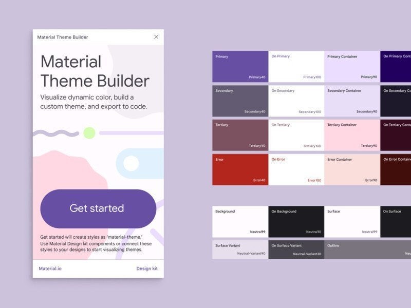
Of course, whether your favorite third-party apps adopt the look of Material You is completely up to the developers themselves. If a developer does decide to do so, Google has provided a new tool to make the transition easier called Material You Theme Builder.

The tool can help developers preview how dynamic colors will look on their apps, design custom themes, and finally—export what they have created as code. Inside the Material You Theme Builder are included kit components, which can be used to shape up the theme a developer wants to build.
You don’t need a Pixel to enjoy Material You
While having a Pixel 3 and above will give you the full dynamic color experience, other phone manufacturers are starting to implement versions of the Android 12 visuals. One such example is none other than Samsung, which recently released a two-part film on YouTube. The film showcases One UI 4 new features and design, including matching the system theme colors to your wallpaper.On a somewhat similar note, Google recently released one more thing for developers—the developer preview of Android 12L for larger-screened Android phones. The “L” stands for large screens, which can be found on foldable phones and tablets. You can find out more in our dedicated Android 12L article.

